
Monday Brand Prompt: Designing NØRA Furniture
Living Beautifully
Snow changes how you see things.
It softens contrast.
It quiets distractions.
It slows the pace of everything—especially thought.
This past week, as the world outside felt muted and still, I found myself drawn to restraint. To simplicity. To design that doesn’t rush to explain itself. And instead of starting with a prompt for others to follow, I went first and now it’s your turn.
I designed alongside the idea.
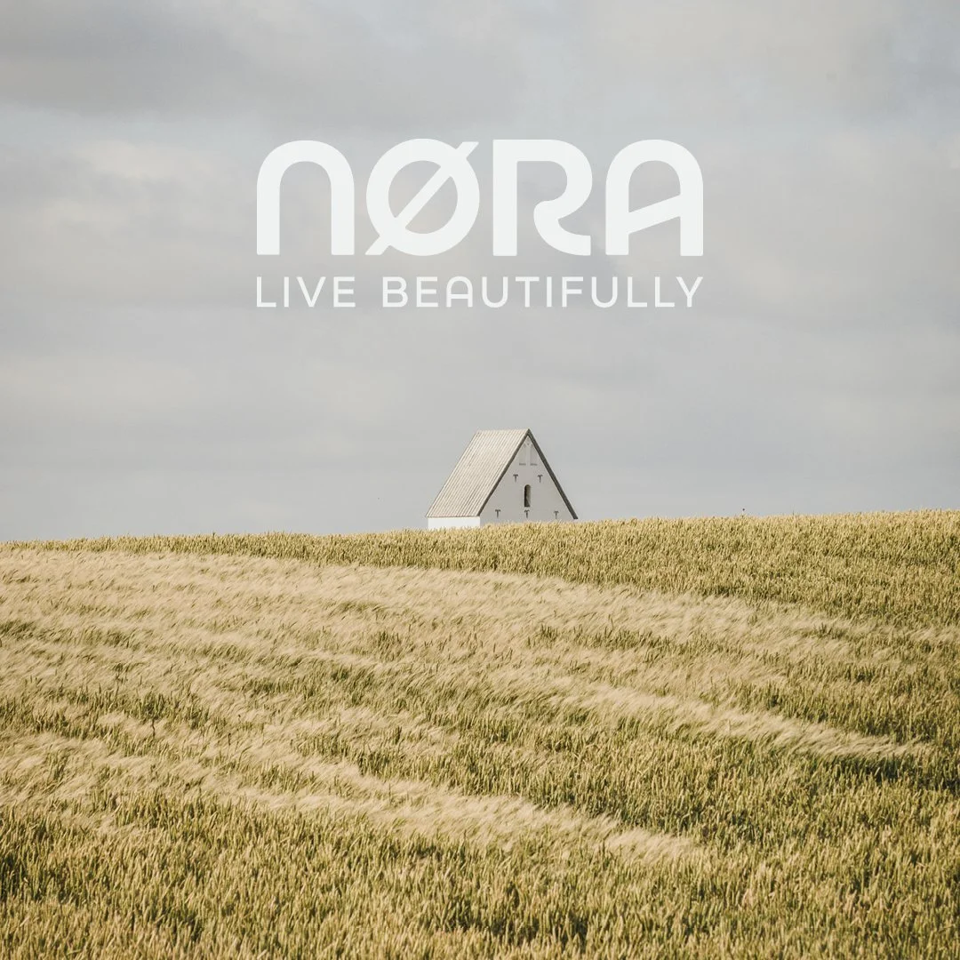
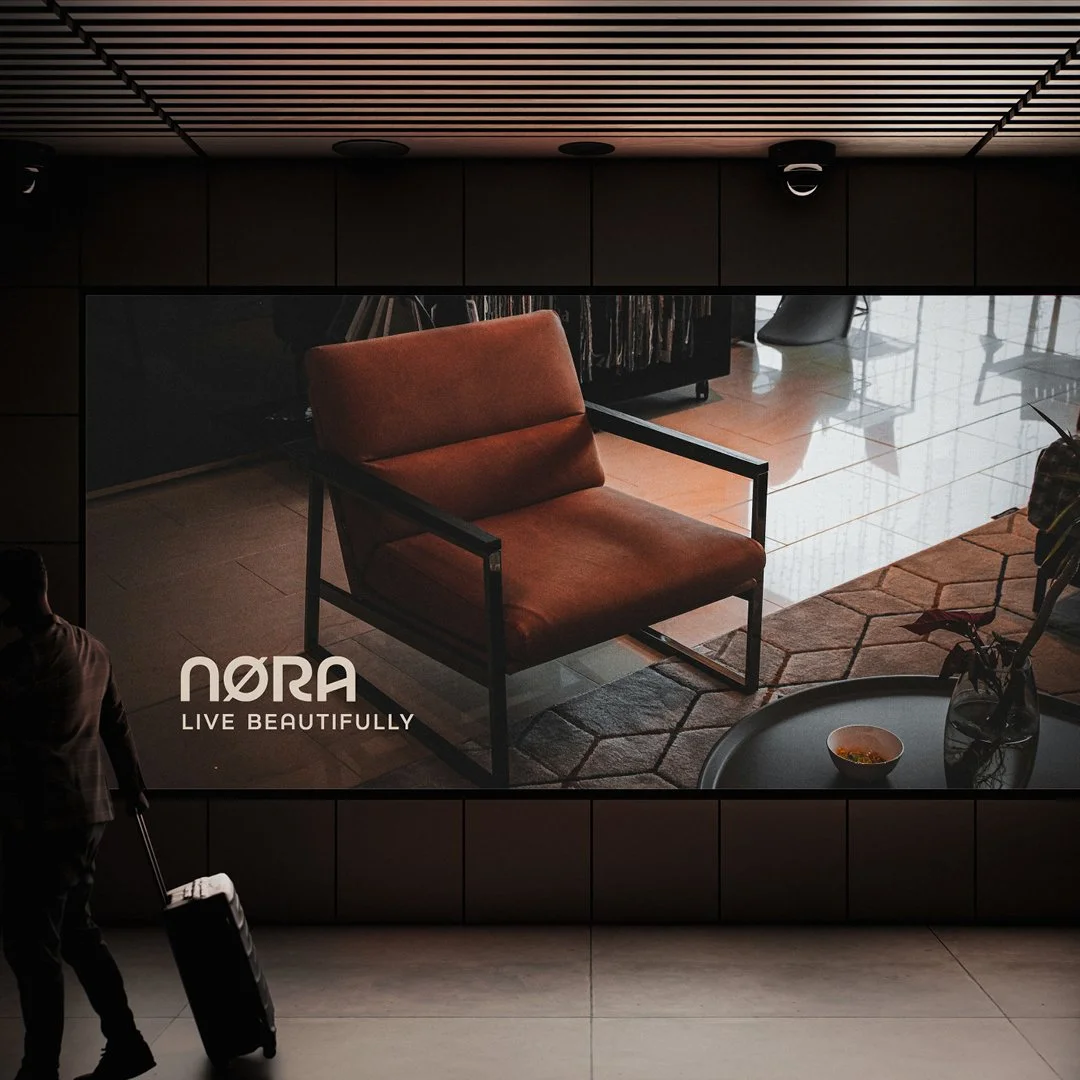
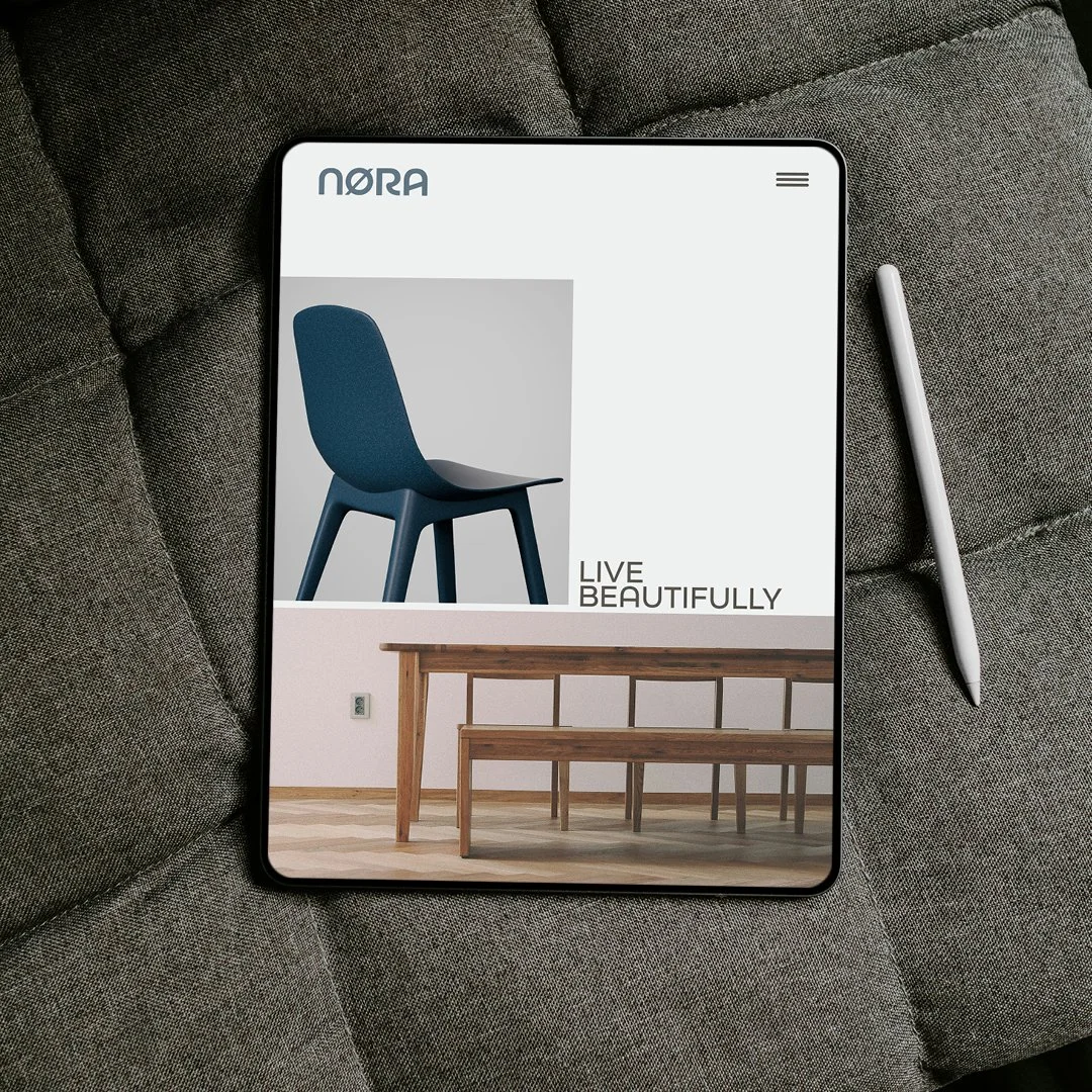
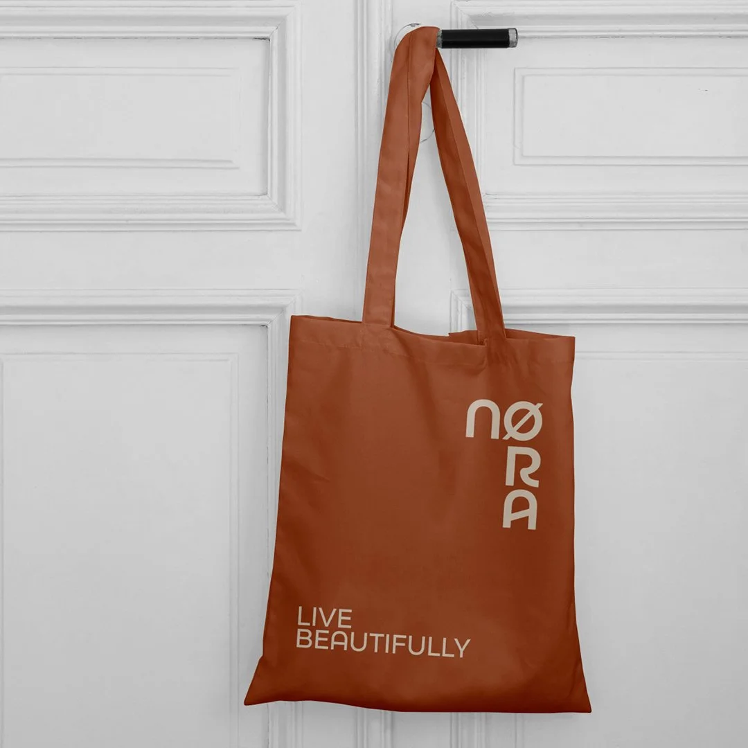
That exploration became NØRA Furniture—a branding prompt rooted in calm, intention, and the idea of Living Beautifully.
This isn’t a fast exercise.
It’s not meant to be loud.
And it doesn’t end with a logo.
This prompt is an invitation to slow down and design something that feels settled.
Why I Went First (And Why That Matters)
Before asking anyone else to explore this prompt, I wanted to experience it myself.
Not to arrive at a “correct” solution—but to understand the questions it raises.
Too often, design prompts focus on output:
A logo
A color palette
A few mockups
But real branding work starts earlier than that.
It begins with restraint.
With discomfort.
With asking what doesn’t need to be there.
Going first allowed me to push the idea further—to explore not just a logo, but what a brand campaign, visual language, and emotional tone might look like for a furniture company built around calm confidence.
That exploration informed this prompt. And now, I’m handing it to you—not as a rulebook, but as a starting point.
Introducing NØRA Furniture
NØRA is a high-end furniture and living brand centered on one idea:
Living Beautifully
Not extravagantly.
Not excessively.
Beautifully.
This brand believes beauty is found in proportion, material, and intention—not decoration.
NØRA creates modern heirloom furniture for people who value presence over noise. Pieces designed to last, both physically and emotionally.
What NØRA Makes:
Low-profile sofas with architectural softness
Solid wood tables crafted from elm, ash, and oak
Modular seating systems that adapt quietly to life
Minimal beds and nightstands designed for calm spaces
This is furniture that belongs in a room—it doesn’t dominate it.
The Feeling Behind the Brand
NØRA isn’t about trends.
It doesn’t chase novelty.
It doesn’t rely on bold gestures.
Instead, it leans into:
Balance
Material honesty
Negative space
Quiet confidence
Think Scandinavian restraint with warmth. Japanese minimalism without austerity. Modern design that feels human, not cold.
The kind of brand that doesn’t ask for attention—but earns it.
Naming & Meaning: Why NØRA Works
At first glance, NØRA feels simple.
But the strength of the name lies in its layers.
It subtly references “Nor” or “Nord,” suggesting northern restraint and clarity
It reads as a human name, grounding the brand emotionally
The Ø introduces Nordic calm without shouting heritage
Importantly, the Ø doesn’t change the meaning—it changes the tone.
This distinction matters in branding.
Clients often ask whether symbols or typographic nuances need to “mean” something literal. The answer is usually no. What matters is how they feel and how they position the brand.
NØRA feels premium, calm, and emotionally neutral—making it an ideal foundation for a high-end furniture brand.
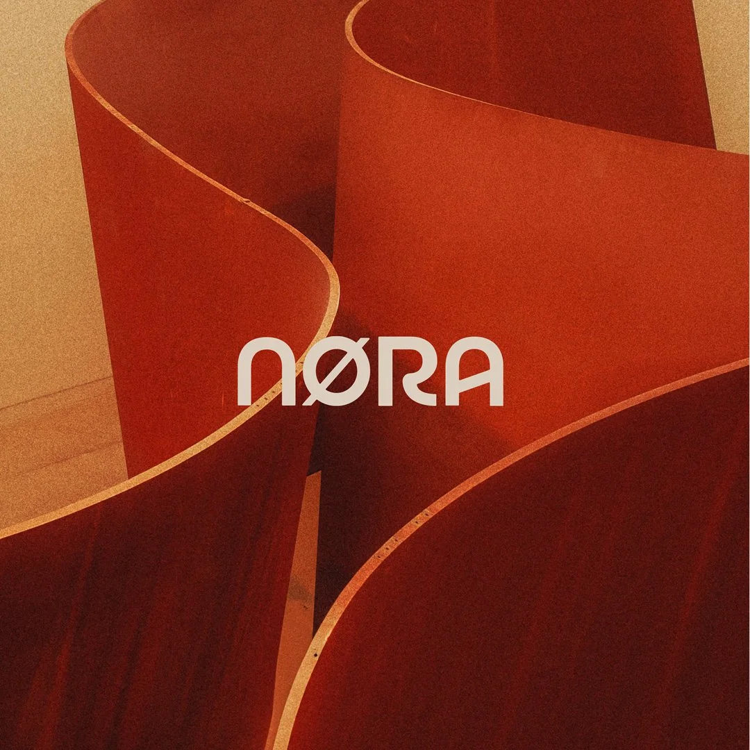
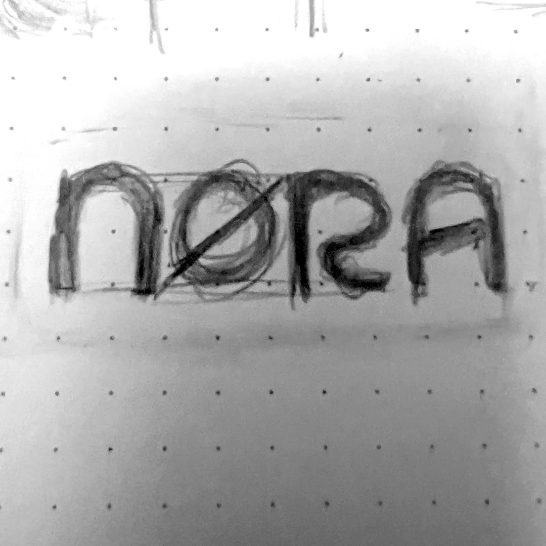
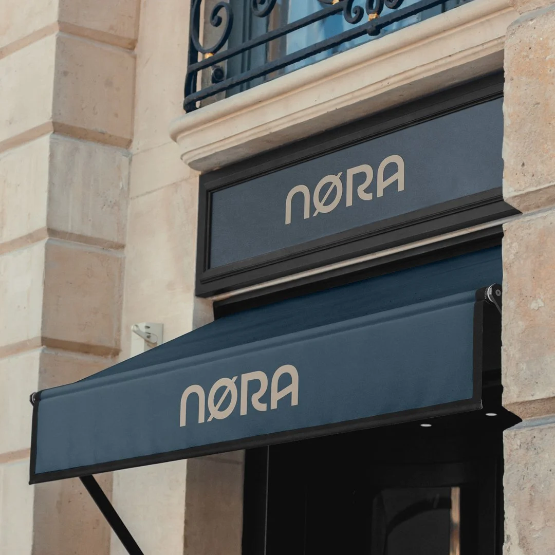
The Wordmark (And Why I Stopped There)
In my own exploration, I landed on a custom wordmark.
Soft geometry.
Balanced proportions.
A restrained Ø that supports the name rather than overtaking it.
But here’s the most important part of this prompt:
You don’t have to land where I did.
You may explore:
An abstract symbol inspired by runes or geometry
A monogram that feels architectural
A purely typographic system
Or no logo mark at all—just a refined wordmark and visual language
The goal isn’t replication.
It’s exploration.
Ask yourself:
Does this brand need a symbol—or does restraint say more?
How does this logo feel at small sizes?
Would it still work blind-debossed into wood or etched into metal?
These are the questions real branding work requires.
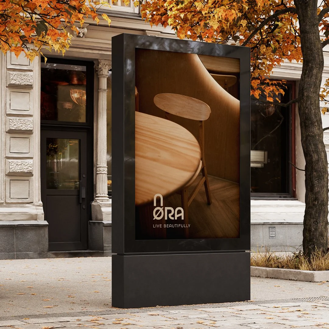
Pushing the Prompt Further: A Brand Campaign
Because it’s been snowy here—and because the mood felt right—I allowed this prompt to extend beyond identity into campaign thinking.
This is optional, but incredibly valuable.
Campaign Concept: Living Beautifully
Photography is minimal.
Natural light only.
No forced styling.
Furniture exists in quiet rooms, surrounded by texture:
Wood grain
Linen
Soft shadows
Negative space
The furniture doesn’t perform—it rests.
Copy is sparse.
Thoughtful.
Almost secondary.
This isn’t advertising.
It’s atmosphere.
What This Prompt Is Really About
At its core, this prompt is about restraint.
That’s difficult—especially in a design culture that rewards excess and speed.
But restraint is where mature design lives.
This exercise challenges you to:
Remove more than you add
Let materials do the talking
Trust spacing and proportion
Design something that feels complete without explanation
Whether you’re building your portfolio or sharpening your thinking, this kind of project demonstrates depth—and clients notice that.
How This Translates to Real Client Work
Here’s where I’ll step out of prompt mode for a moment.
Businesses don’t hire designers just for visuals.
They hire designers to solve problems.
A brand like NØRA solves:
Visual inconsistency
Lack of trust
Brands that don’t reflect product quality
The disconnect between craft and perception
High-end furniture and lifestyle brands need clarity and restraint to communicate value. When branding aligns with material quality, everything feels intentional.
This is where thoughtful brand identity design becomes a business tool—not just a visual one.
Designing the Prompt Yourself
If you choose to explore NØRA, take your time.
Sketch slowly.
Test fewer ideas.
Sit with discomfort.
You might:
Start with typography only
Build a material-first palette
Design one hero application instead of ten mockups
Explore how the brand behaves in silence
There’s no deadline here. Only discovery.
A Quiet Invitation
If you’re a business owner—especially in furniture, interiors, or lifestyle—and your brand no longer reflects the care you put into what you make, that gap matters.
Branding should feel like an extension of your craft.
And if you’re a designer looking to move beyond surface-level work, this is the kind of thinking that builds trust—with clients and with yourself.
You can explore more prompts like this at
zachsummers.net
And if you’re looking for brand identity or logo design that’s intentional, refined, and built to last—I’d love to help.
Final Thoughts
NØRA Furniture isn’t just a branding prompt.
It’s a reminder:
To slow down
To design with care
To trust subtlety
Whether you arrive at a wordmark, a symbol, or something entirely unexpected—what matters is that it feels true.
Living Beautifully starts with intention.