
Your brand should
carry the weight
of your mission.
Ministry budgets are real. Timelines are tight. And the stakes — a new church plant, a rebrand before a big outreach, a ministry launching its first campaign — are high.
These packages were designed so you don't have to sacrifice professional, lasting brand work for what's affordable. Each tier is priced to fit where you are, with the quality to carry you where you're going.


Branding is stewardship.
I've spent 20 years doing design work at the intersection of faith and visual identity — from local church plants to national ministry campaigns. This work isn't a side project for me. It's one of the things I'm most passionate about.
Mission-driven organizations face a challenge most businesses don't: the stakes are spiritual, the audience is searching for something real, and the budgets rarely match the scale of the vision. A weak brand creates friction between your message and the people you're trying to reach. A strong one removes it.
Your church's visual identity is the first thing a searching family sees before they ever walk through your doors. It deserves the same faithfulness and intention you bring to the work itself.
That's why I built three tiers of ministry branding packages — each one designed around where a church actually is. Seed is for the plant or relaunch that needs a strong foundation to build from. Roots is for the growing church ready to show up consistently across every platform. Legacy is for the church with momentum that wants a brand system built to last. Take a look below and reach out when you're ready to talk.
-
For the church just taking root. Everything you need to launch with confidence.
$650
Custom logo design (primary + alternate marks)
3 logo concepts with 1 round of changes to the selected logo
Color palette with basic usage guidance
Typography selection (2 font pairings)
3 branded social media templates
Final files in all formats (PNG, SVG, PDF
-
For a growing church ready to show up consistently across every platform.
$900
10 page Brand identity style guide (PDF)Brand identity style guide
5 logo design concepts. 1 round of changes to selected concept
6 branded social media templates
Sermon series graphic template
print template (1 design)
-
For the church with momentum — building a brand that will outlast the season.
$1,500
Extended brand style guide
5 logo design concepts 2 rounds of changes to selected concept
10 branded social media templates
2 print templates
Email header template
Past Project
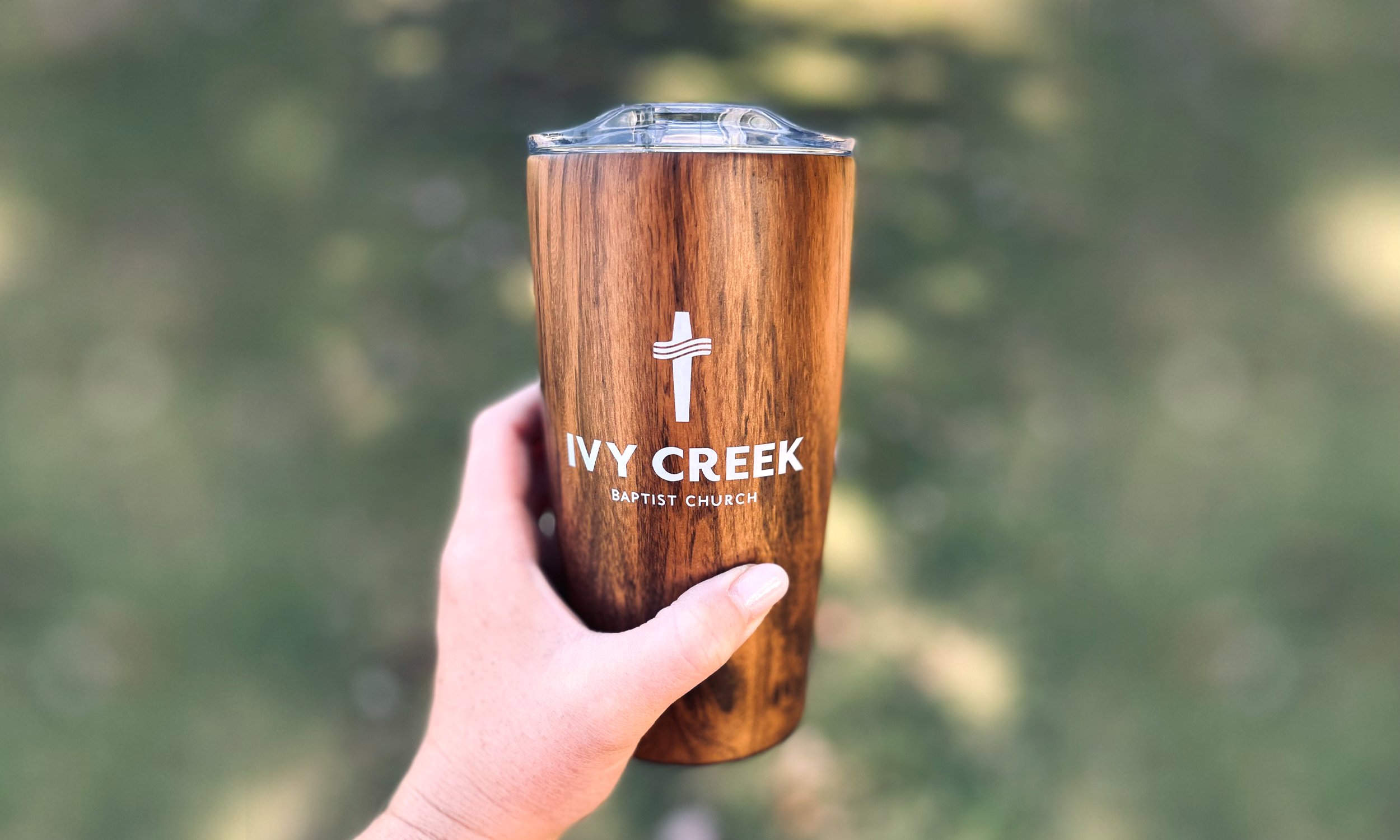
Ivy Creek Church Rebrand
The refreshed identity was designed to work everywhere, every time. Clean structure, simplified details, and a modern approach that still honors the church's values and sense of community. The logo now scales seamlessly from a website favicon to a large building sign, maintaining clarity and recognition at every size. More importantly, it removes visual friction — letting the church's message, community, and invitation come through clearly across every platform.".

Frequently Asked Questions
-
The craft is the same — this is the same design process, the same strategic thinking, and the same level of quality I bring to every project. The difference is that these packages are specifically scoped and priced for churches and ministries, so you're not paying for deliverables you won't use or guessing whether the investment makes sense for your budget.
-
Absolutely. Each tier is designed to build on the last. If you start with Seed and your church grows into needing a full brand system, we can continue from where you left off — nothing gets thrown away.
-
Yes. These packages are a great fit for any mission-driven organization — church plants, established congregations, parachurch ministries, Christian nonprofits, and faith-based community organizations. If the work you're doing carries purpose, these packages were built for you.
“Zach has done work for us and has always been exceptional, Creative, talented and trustworthy!”
— Ted - Ivy Creek Baptist ChurchLet’s Work Together
If you're interested in working with me, complete the form with a few details about your project. We'll review your message and get back to you within 48 hours.