Ivy Creek Baptist Church Rebrand
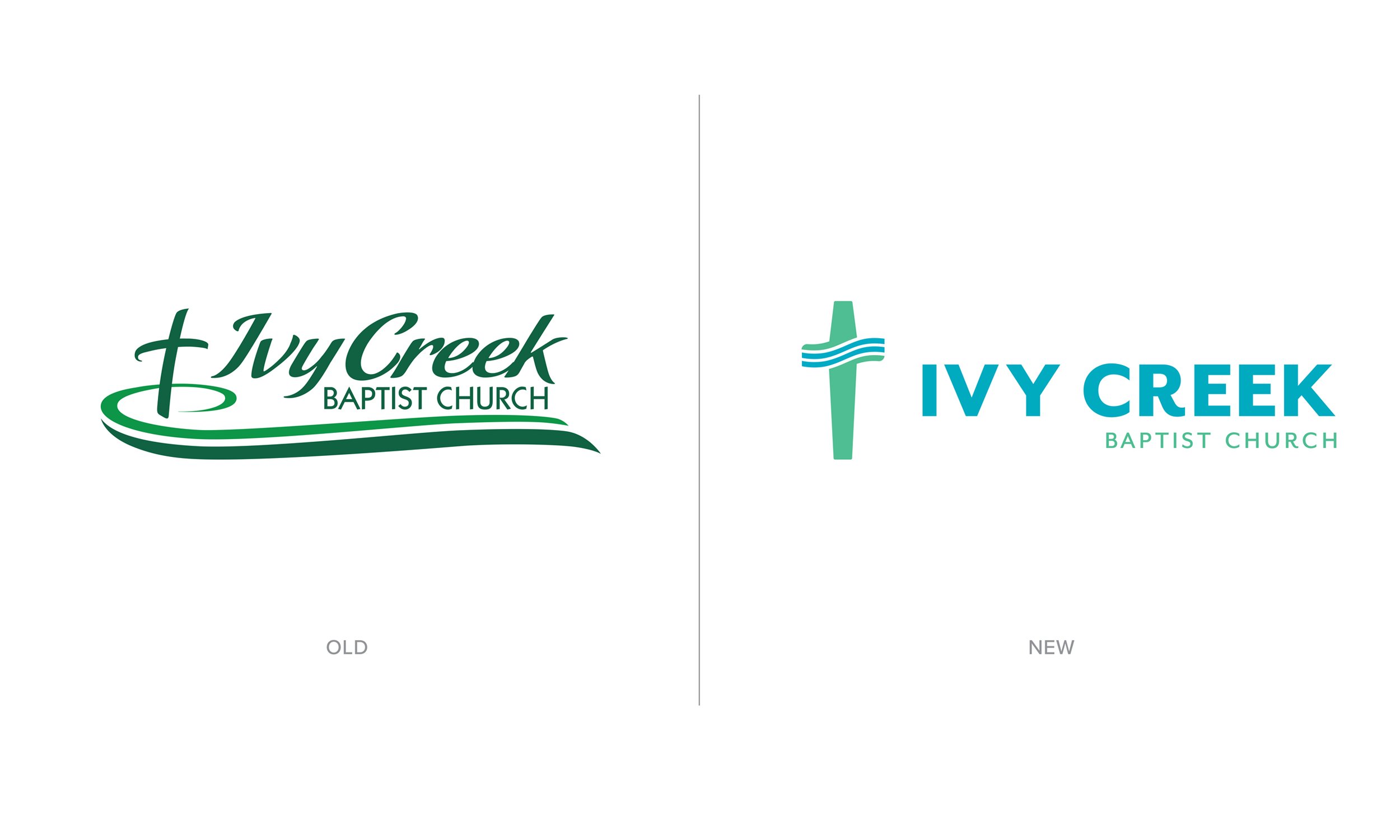
Ivy Creek Baptist Church was preparing for a new building and expanded community outreach when they realized their brand identity couldn't keep up. Their existing logo struggled with clarity across different sizes and applications — it looked fine on a printed bulletin but lost detail on social media, and it didn't translate well to the large-format signage their new building would require.
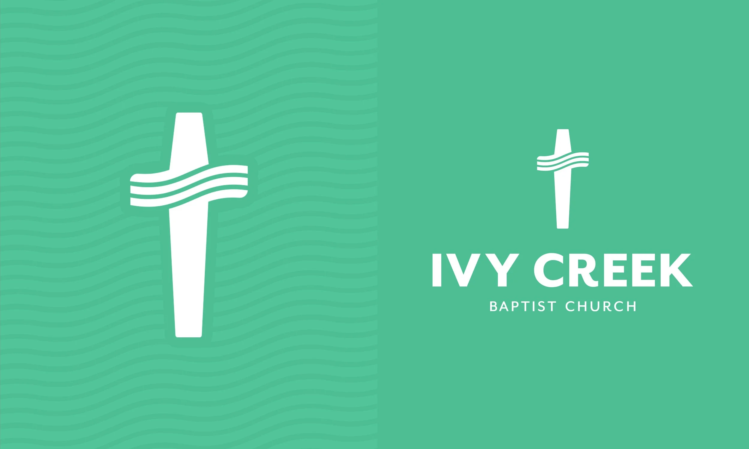
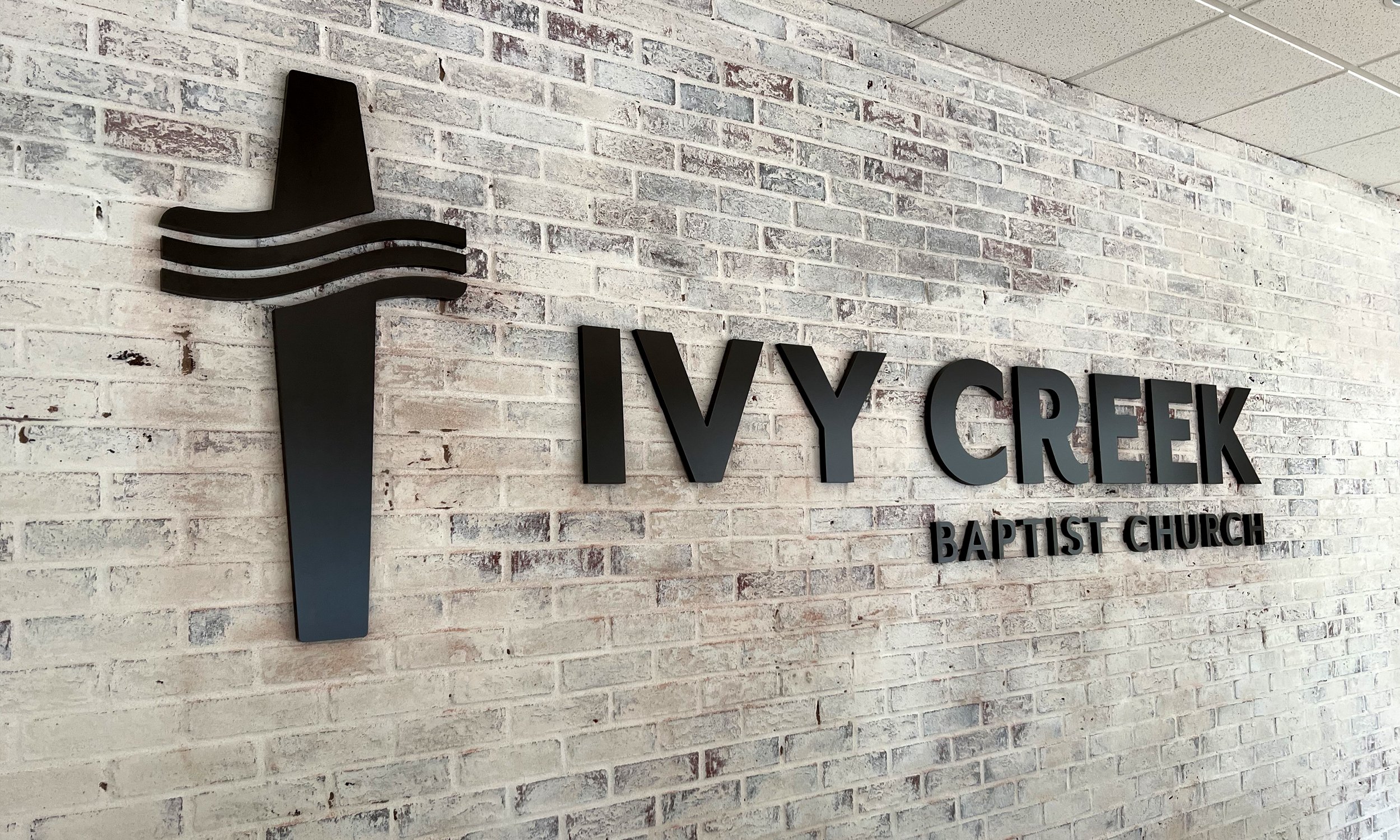
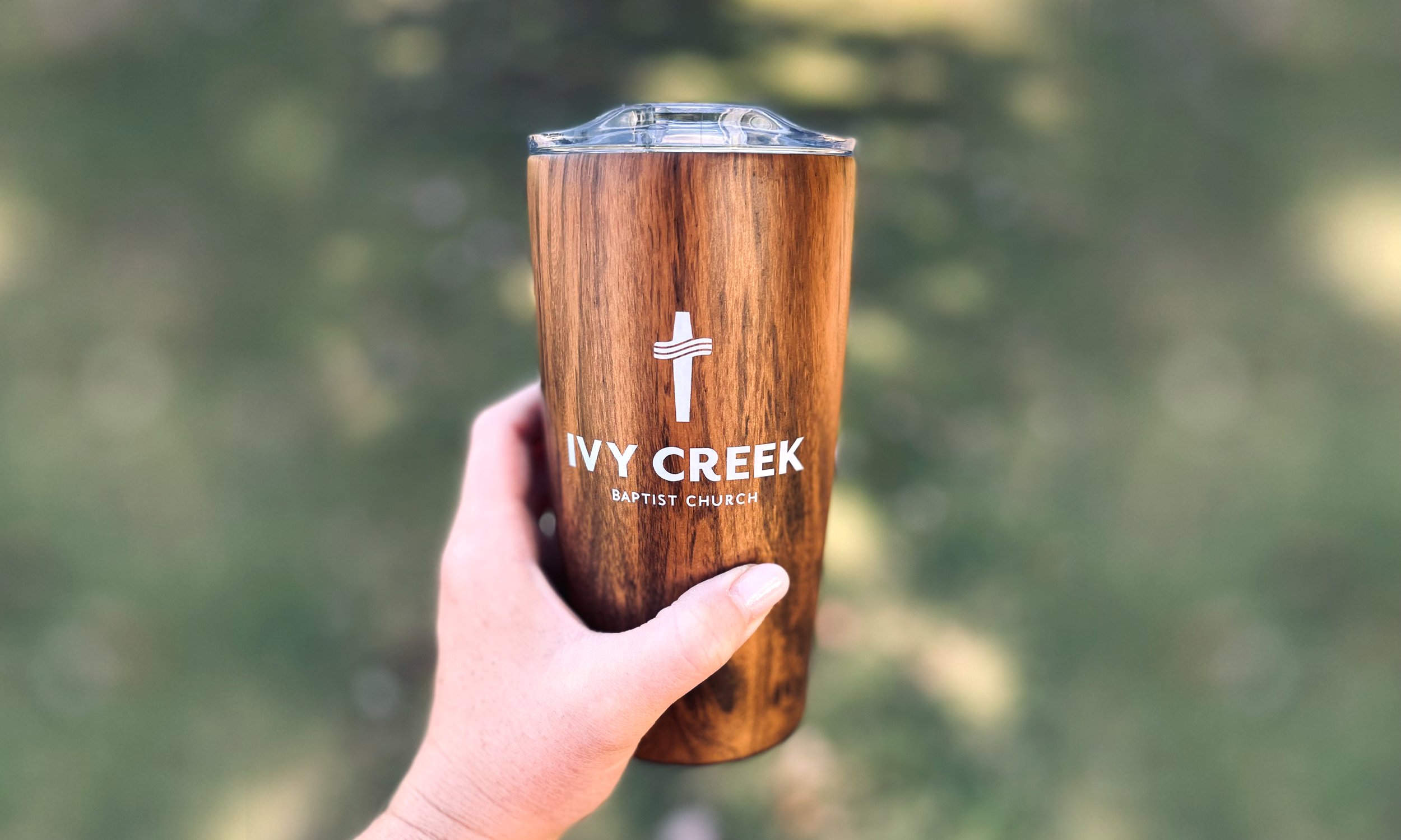
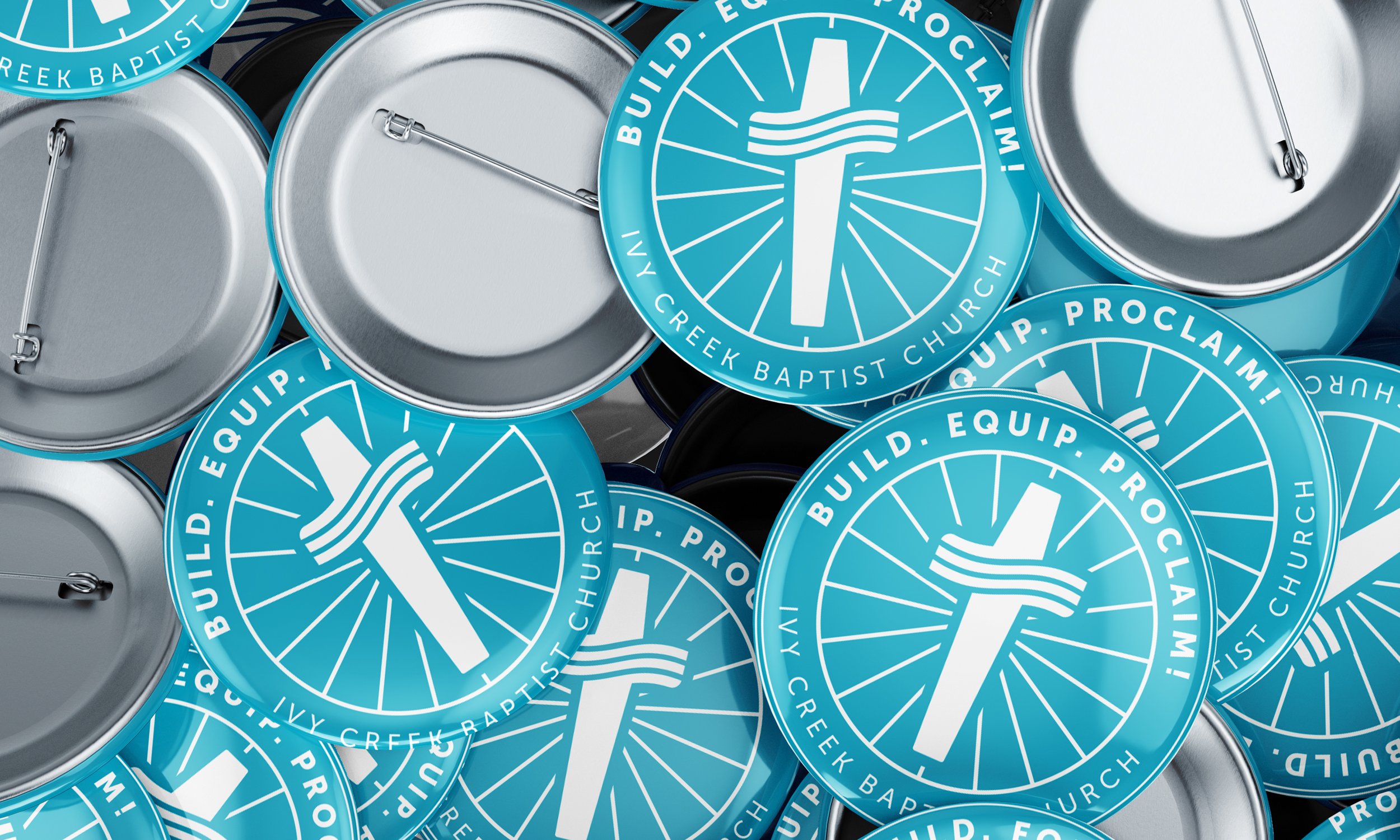
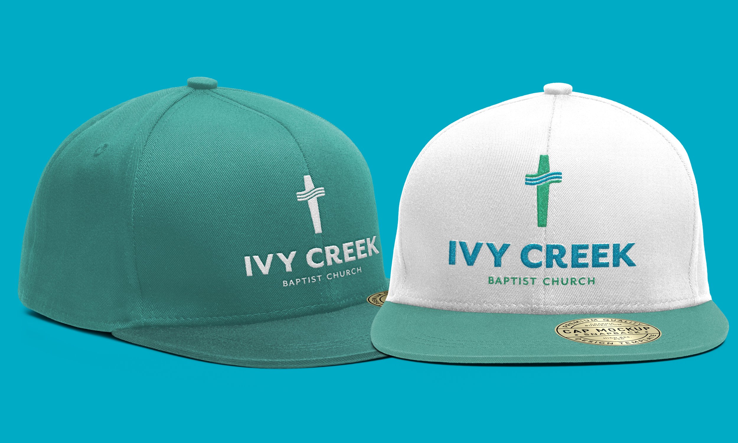
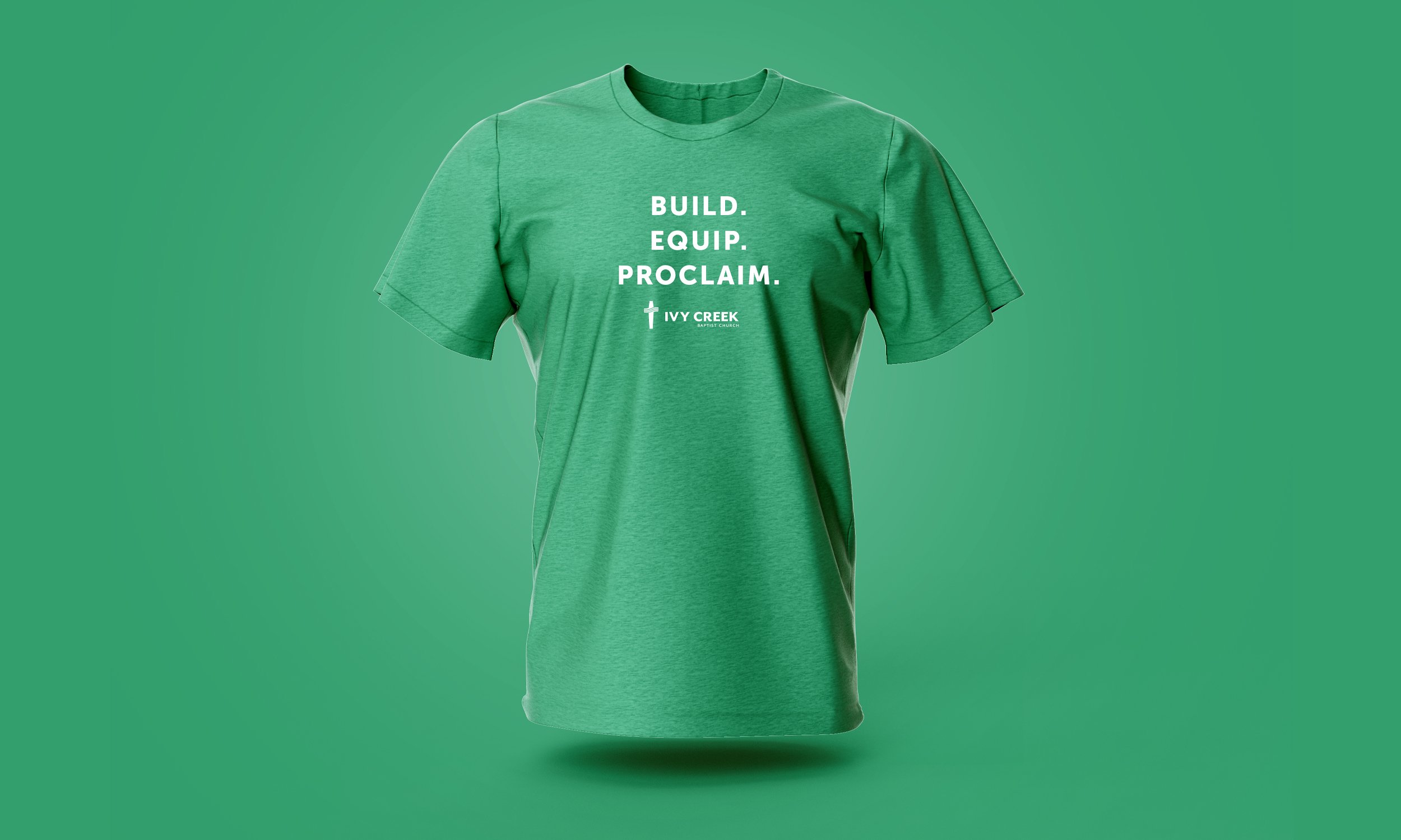
The refreshed identity was designed to work everywhere, every time. Clean structure, simplified details, and a modern approach that still honors the church's values and sense of community. The logo now scales seamlessly from a website favicon to a large building sign, maintaining clarity and recognition at every size. More importantly, it removes visual friction — letting the church's message, community, and invitation come through clearly across every platform."
The Challenge: Preparing for Growth
Church rebrands are uniquely challenging. The visual identity needs to honor tradition and community memory while also positioning the organization for future growth. For Ivy Creek Baptist Church, the timing was critical — a new building was under construction, community outreach was expanding, and digital engagement was becoming increasingly important for connecting with both current members and visitors.
Their previous logo had served them well for years, but it wasn't designed for the realities of modern communication. The mark included fine details that disappeared at small sizes, making it ineffective on mobile devices and social media. It lacked the versatility needed for vehicle graphics, directional signage, and the large exterior signage the new building required. The church needed an identity that could carry them forward without losing the recognition they'd built.
The Approach: Clarity Without Complexity
The rebrand focused on simplification, not reinvention. Rather than creating something entirely new, we refined and modernized the existing concept — preserving enough visual continuity that longtime members would recognize the evolution while ensuring new visitors encountered a professional, welcoming brand.
The updated logo uses cleaner lines, better proportions, and a more versatile structure. It works in full color, single color, and reversed applications. It maintains legibility whether it's embroidered on a shirt, printed on a welcome packet, or displayed on a building exterior. The result is a visual identity that supports the church's mission by being clear, consistent, and effective across every context where the community encounters it.