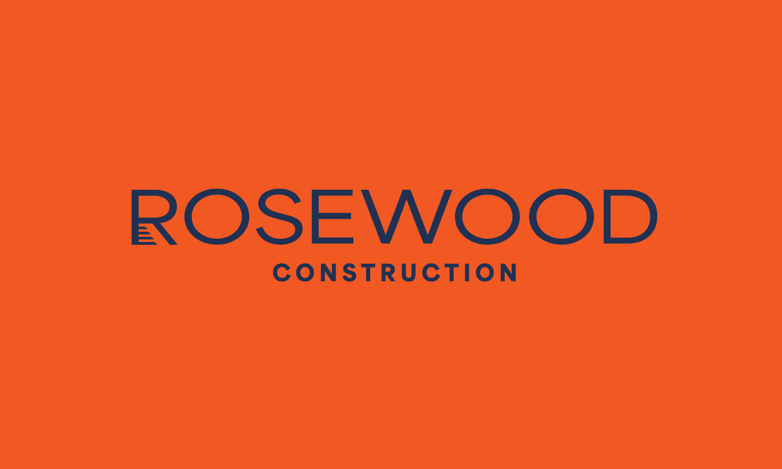
Rosewood Construction
Rosewood Construction needed an identity that could communicate quality without saying a word. As a builder focused on high-end residential construction, their brand had to signal craftsmanship, precision, and attention to detail across every touchpoint — from signage and vehicles to digital platforms and client presentations.
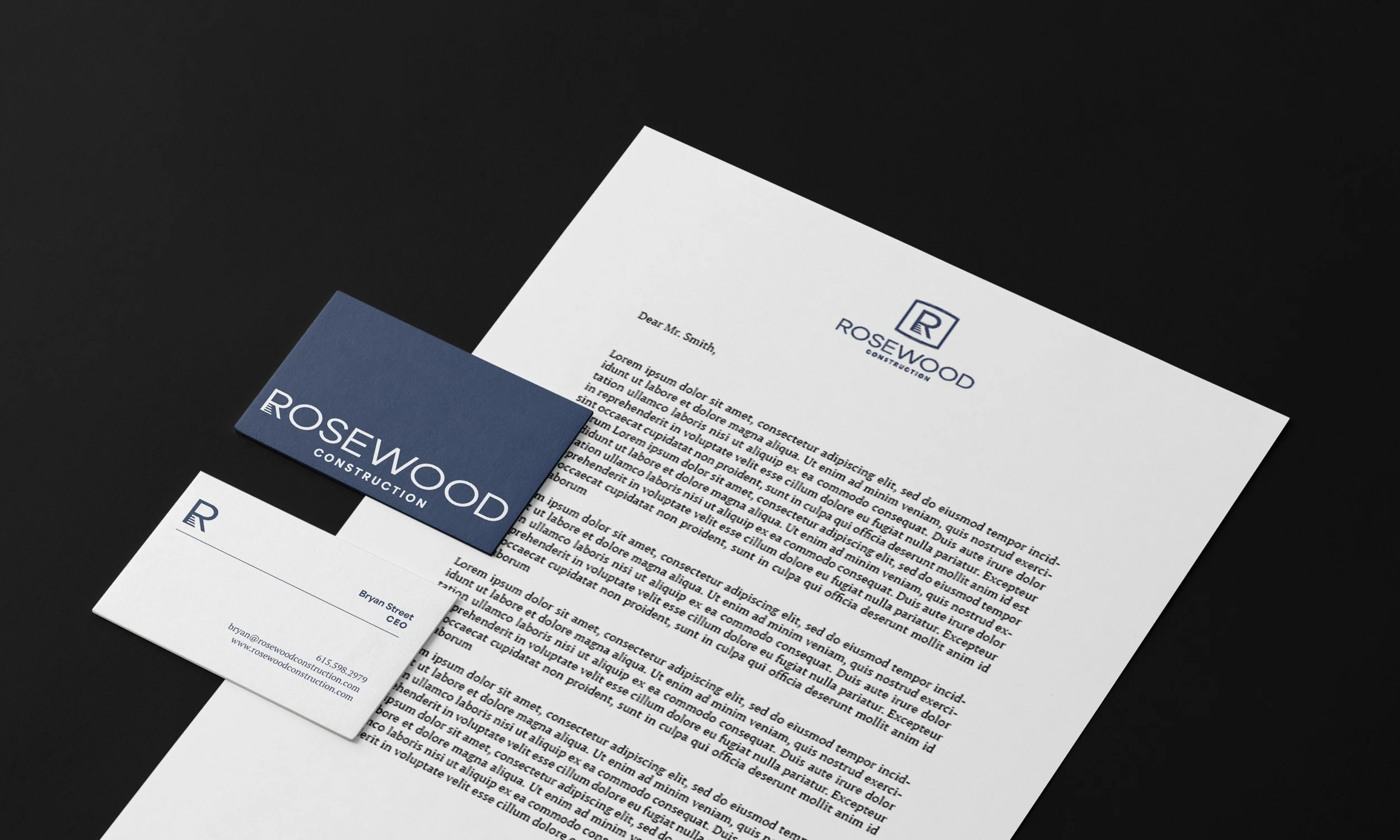
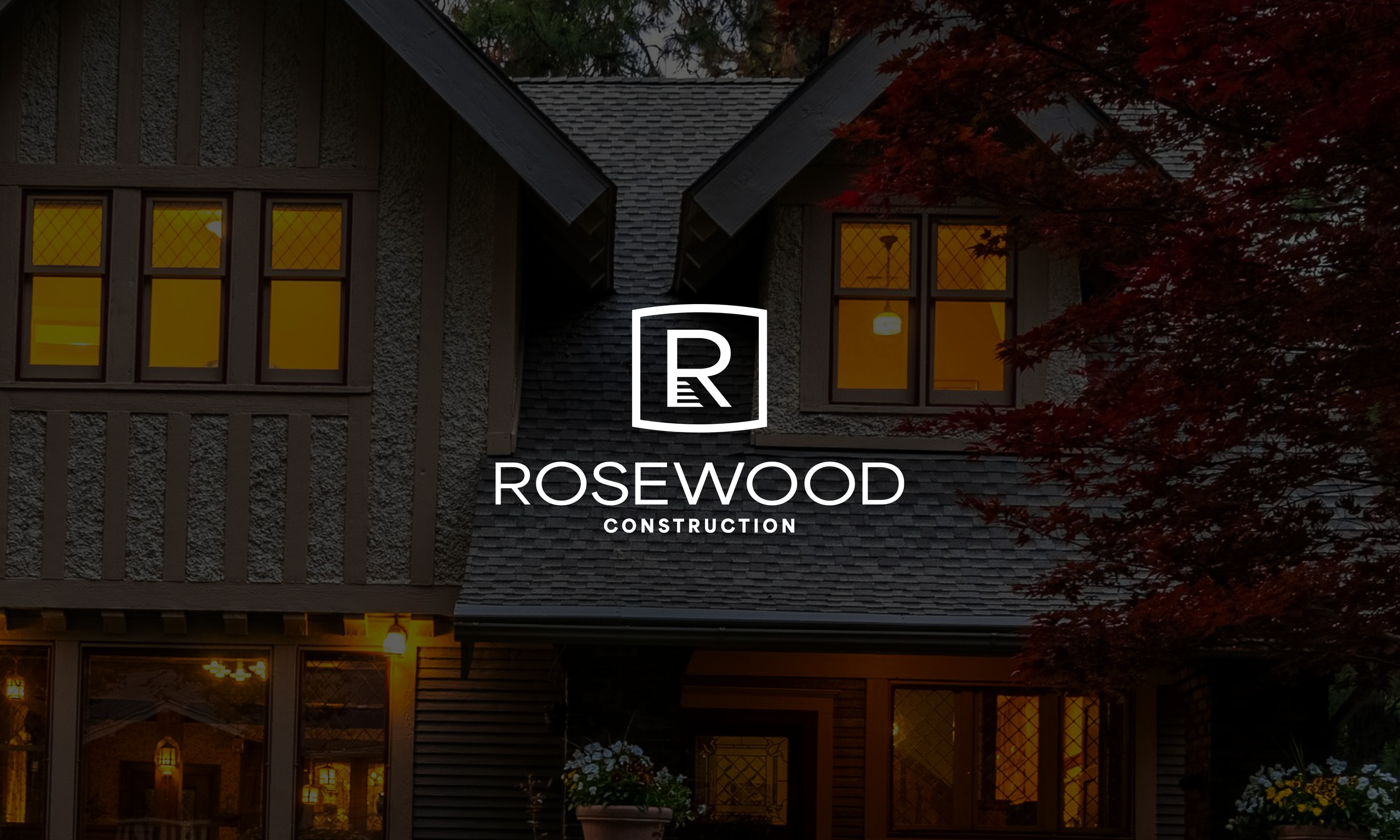
The solution was a refined, geometry-driven mark built around a single letterform. The design subtly references stairs and architectural structure, creating a mark that feels intentional and purpose-built. Every element was designed for clarity, balance, and longevity — the kind of logo that feels established from day one and remains effective as the business grows. The final identity positions Rosewood Construction as a modern, luxury-minded builder where quality is never compromised.
The Challenge: Competing in the Luxury Market
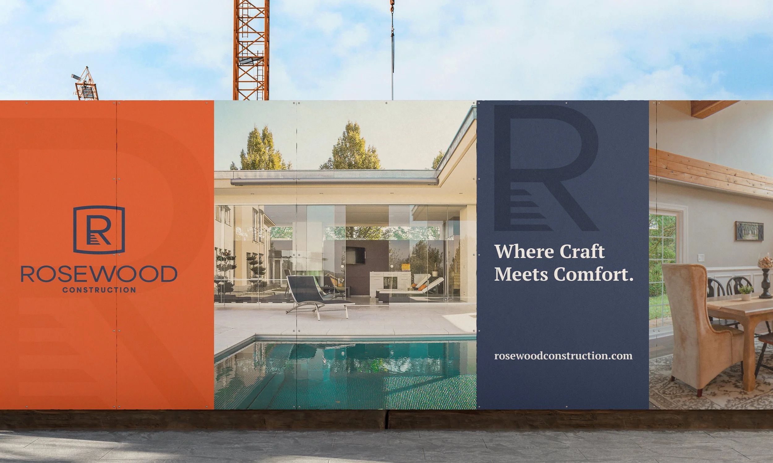
In high-end residential construction, perception is everything. Homeowners investing $500,000+ in a custom build or renovation aren't just hiring a contractor — they're choosing a partner they trust to bring their vision to life. For Rosewood Construction, competing in this market meant looking the part before the first conversation even happens.
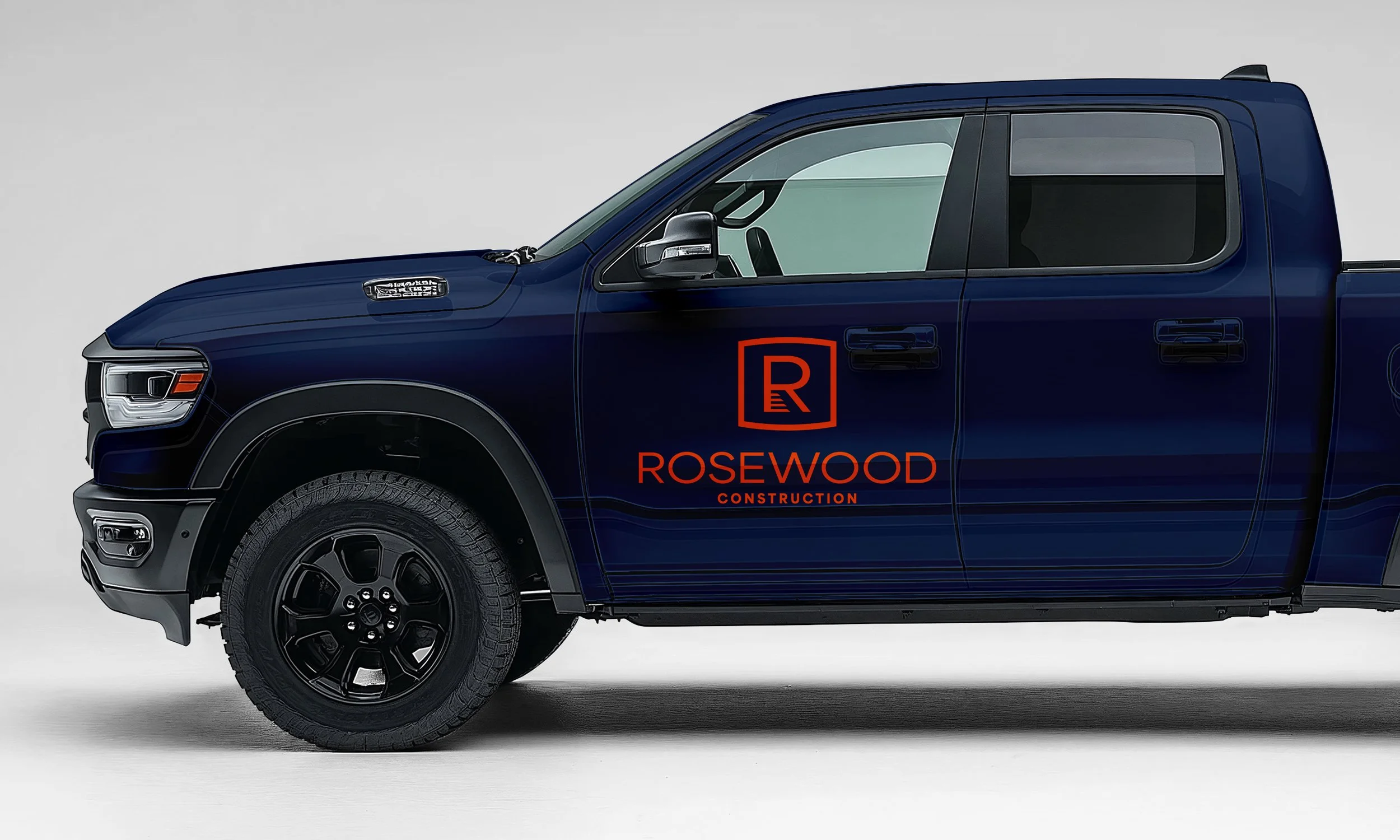
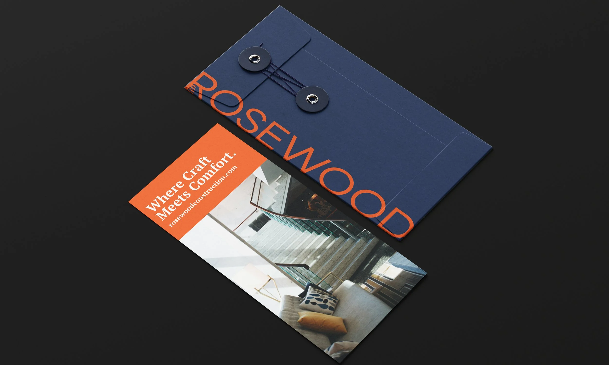
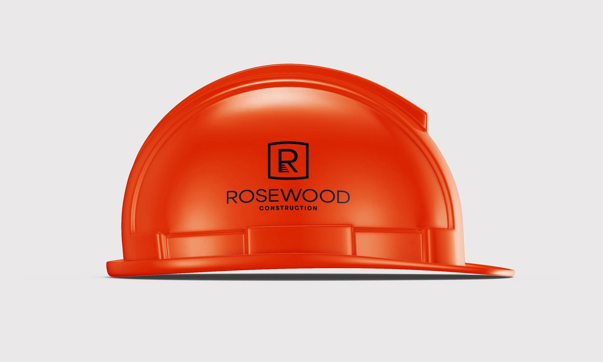
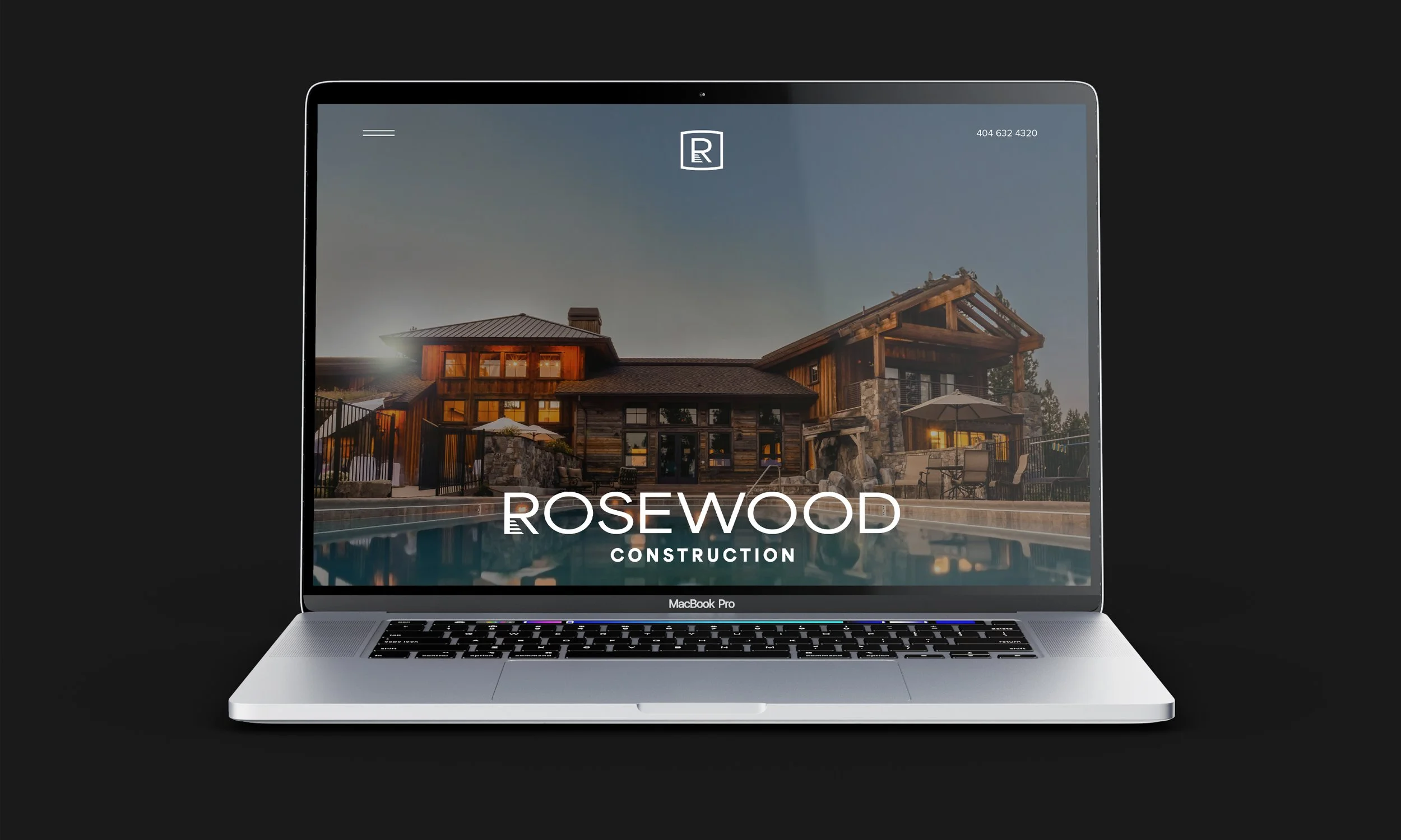
Their branding needed to communicate sophistication and credibility instantly. The logo would appear on proposals, job site signage, and vehicles parked in upscale neighborhoods. It needed to feel modern and design-forward without being trendy, and it needed to work seamlessly alongside the architectural firms and interior designers their clients typically work with.
The Approach: Minimal Complexity, Maximum Impact
The logo system was designed with architectural restraint. Rather than relying on literal imagery or construction clichés, the mark uses clean geometry and subtle symbolism. The stair-inspired structure references progress, elevation, and craftsmanship — concepts that resonate with both the construction process and the aspirational nature of custom homebuilding.
The monochromatic color palette ensures the brand feels timeless and sophisticated, while the clean letterforms guarantee legibility across all applications. The result is a visual identity that feels at home in both traditional and contemporary contexts — essential for a builder working across varied architectural styles.
This isn't a logo that screams for attention. It's a mark that earns respect through clarity, precision, and thoughtful design — the same qualities Rosewood Construction brings to every project.