Fischer Painting Services
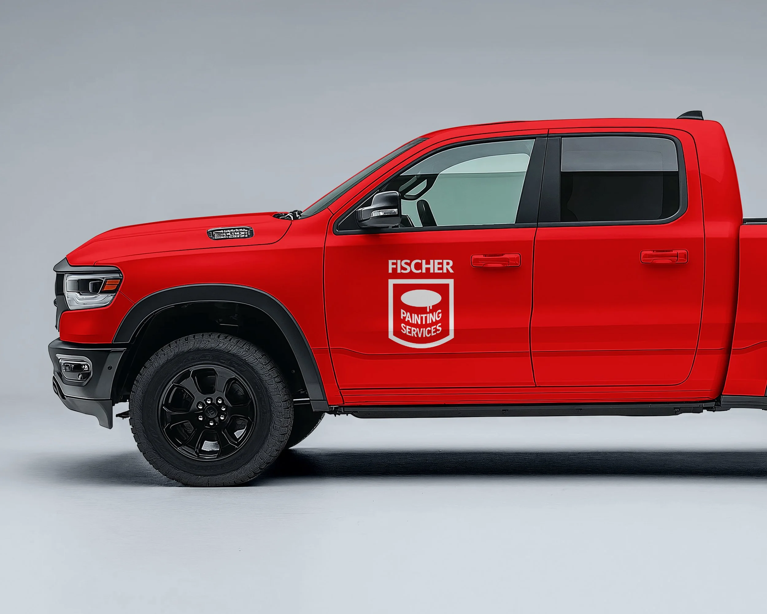
Fischer Painting Services needed a logo that could actually work — clear enough to read on a moving truck, professional enough to win trust at first glance, and simple enough to work everywhere from business cards to job site signage. Operating across Gainesville and the greater Atlanta area, they needed an identity that felt established and dependable without looking generic.
The solution was a straightforward, typography-driven mark built for real-world use. Clean color, strong contrast, and zero unnecessary detail. Every choice was made for clarity and longevity — the kind of logo that looks just as good in ten years as it does today. The final identity gives Fischer Painting a confident, consistent presence across vehicles, print, and digital platforms, helping them stand out as a professional painting contractor ready to deliver quality work.
The Challenge: Standing Out in a Crowded Market
Residential painting is a competitive industry. When homeowners search for painting contractors in the Atlanta area, they're met with dozens of options — many with similar names, similar services, and similar promises. For Fischer Painting Services, the challenge wasn't just creating a logo. It was building a brand identity that would help them compete for higher-value residential projects and differentiate themselves from commodity contractors who compete primarily on price.
Their previous branding was inconsistent and lacked the polish needed to attract discerning homeowners willing to invest in quality craftsmanship. They needed a visual identity that could communicate professionalism, reliability, and attention to detail — the exact qualities that matter most when someone is inviting a contractor into their home.
The Approach: Built for Visibility and Trust
The logo system was designed with two critical requirements: maximum visibility and instant credibility. The mark needed to work flawlessly on large-format vehicle wraps, where legibility at a distance is essential for brand awareness and lead generation. At the same time, it needed to feel polished and professional on smaller touchpoints like business cards, estimates, and digital communications.
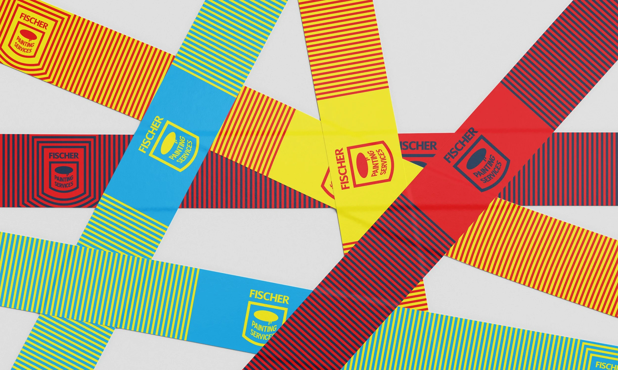
The color palette was carefully chosen to balance visibility with sophistication. The typography is clean and modern without feeling trendy — ensuring the brand remains current and professional for years to come. This isn't a logo that will need replacing in three years. It's built to grow with the business and maintain its effectiveness across every application, from job site signage to social media presence.