Habitation House Design
Wendi Miller needed a rebrand for Habitation House Design that would better reflect her architectural design philosophy: that our daily habits shape the spaces we live in, and those spaces shape our lives. Based in Atlanta, she wanted a mark that felt simple, elegant, and timeless — something that could work across different architectural styles without feeling dated or trendy.
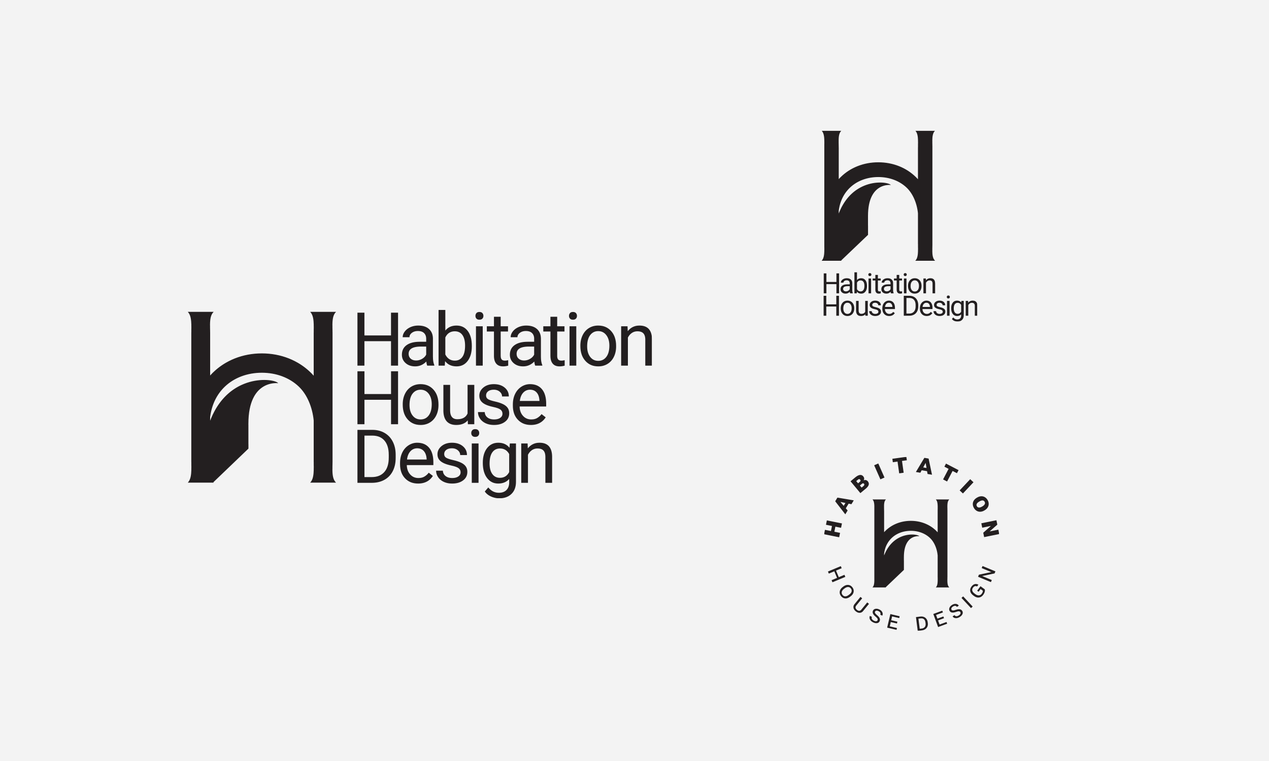
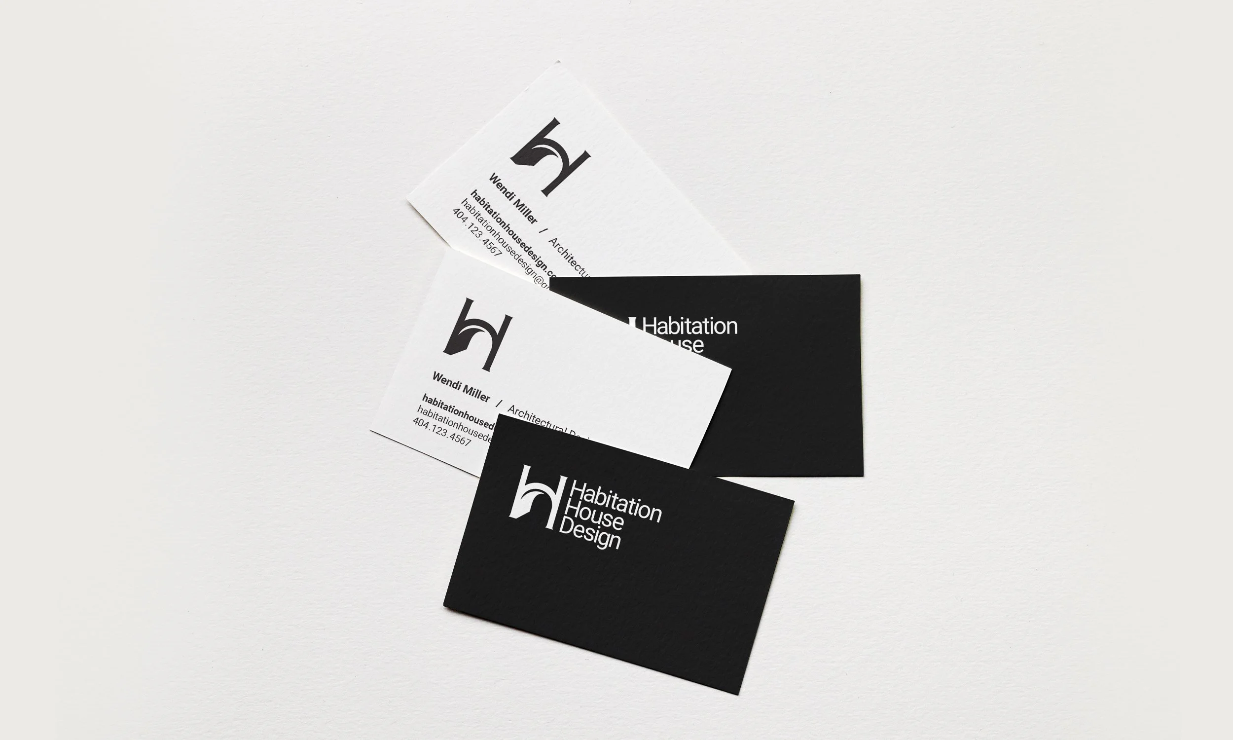
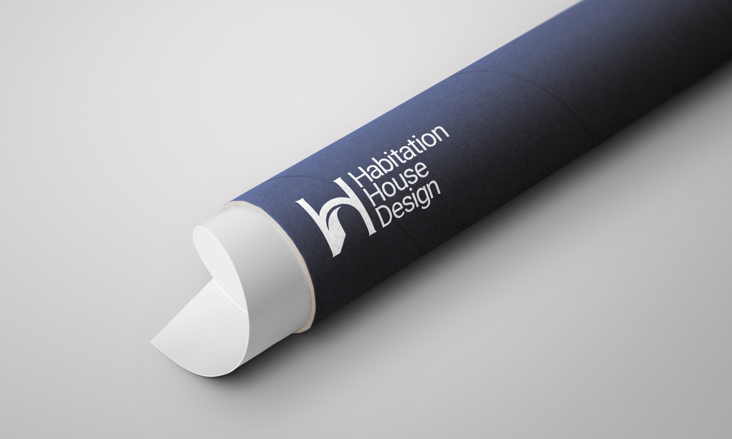
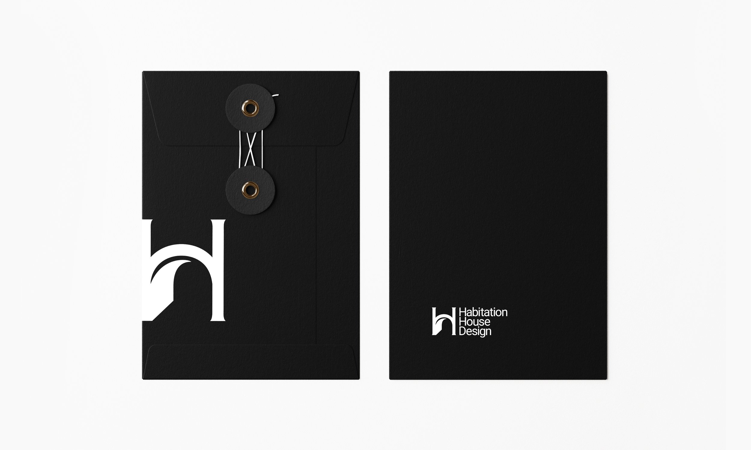
After exploring dozens of concepts, we landed on a refined typographic solution that modernizes the brand while maintaining a classic sensibility. The mark is intentionally restrained, allowing Wendi's architectural work to remain the focus while giving the studio a cohesive, professional identity that works beautifully across presentations, signage, and digital platforms."
The Challenge: Reflecting Philosophy Through Design
Habitation House Design isn't just about drawing floor plans — it's about creating spaces that support the way people actually live. Wendi's philosophy centers on the idea that our daily routines and habits form the foundation of our lives, and thoughtful architecture can support those patterns in meaningful ways. Her previous brand didn't capture this depth of thinking or position her as the strategic, intentional designer she is.
The challenge was creating a visual identity that could communicate simplicity, intention, and architectural thinking without relying on obvious symbolism or overly decorative elements. The logo needed to work equally well on a presentation board for a modern farmhouse as it would on materials for a traditional Southern home.
The Approach: Simplicity as Strategy
Rather than designing around architectural imagery, we focused on typography and proportion — the same principles that guide good architectural design. The letterforms were carefully refined to create a mark that feels both current and enduring. The result is a logo that doesn't compete with Wendi's work but instead provides a quiet, confident foundation for it.
The typographic solution allows the brand to remain versatile across different project types and client aesthetics. Whether the project is contemporary, traditional, or transitional, the logo maintains its clarity and professionalism. It's a visual identity that respects the craft of architecture by embracing the same principles: proportion, balance, and restraint. This rebrand positions Habitation House Design as a thoughtful, design-forward studio where every detail is considered.