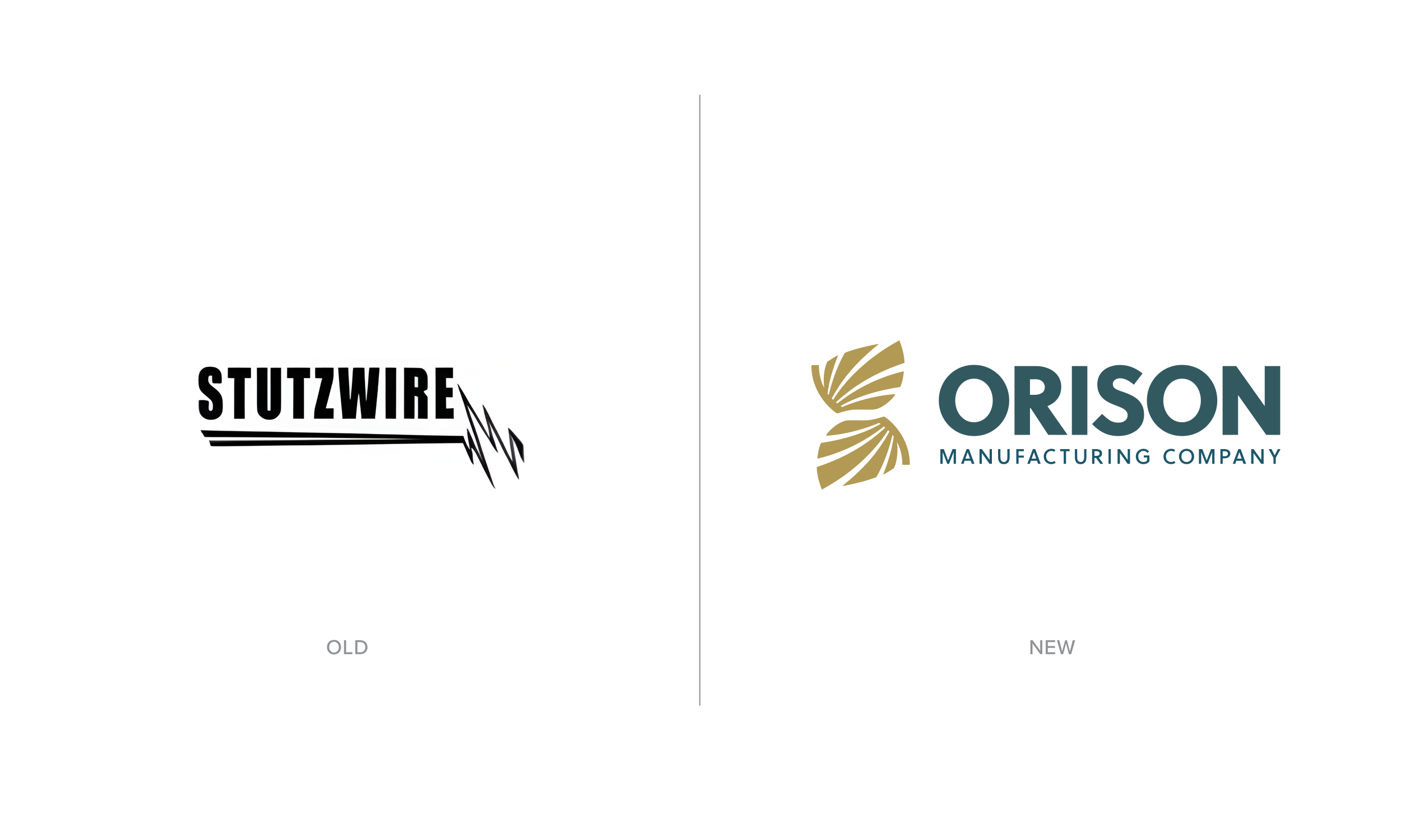
Orison Manufacturing Rebrand
Orison Manufacturing came to this rebrand at a turning point — a company name change and a strategic move into pharmaceutical and healthcare manufacturing. They needed an identity that could immediately establish credibility in a heavily regulated industry while still communicating the values that set them apart: precision, care, and purpose.
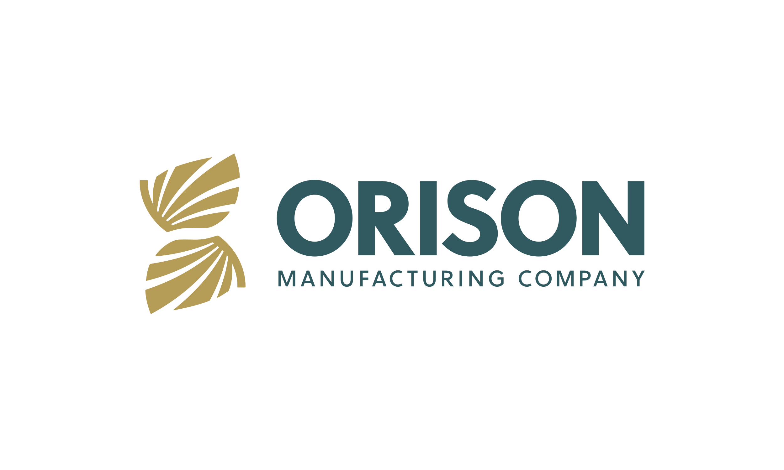
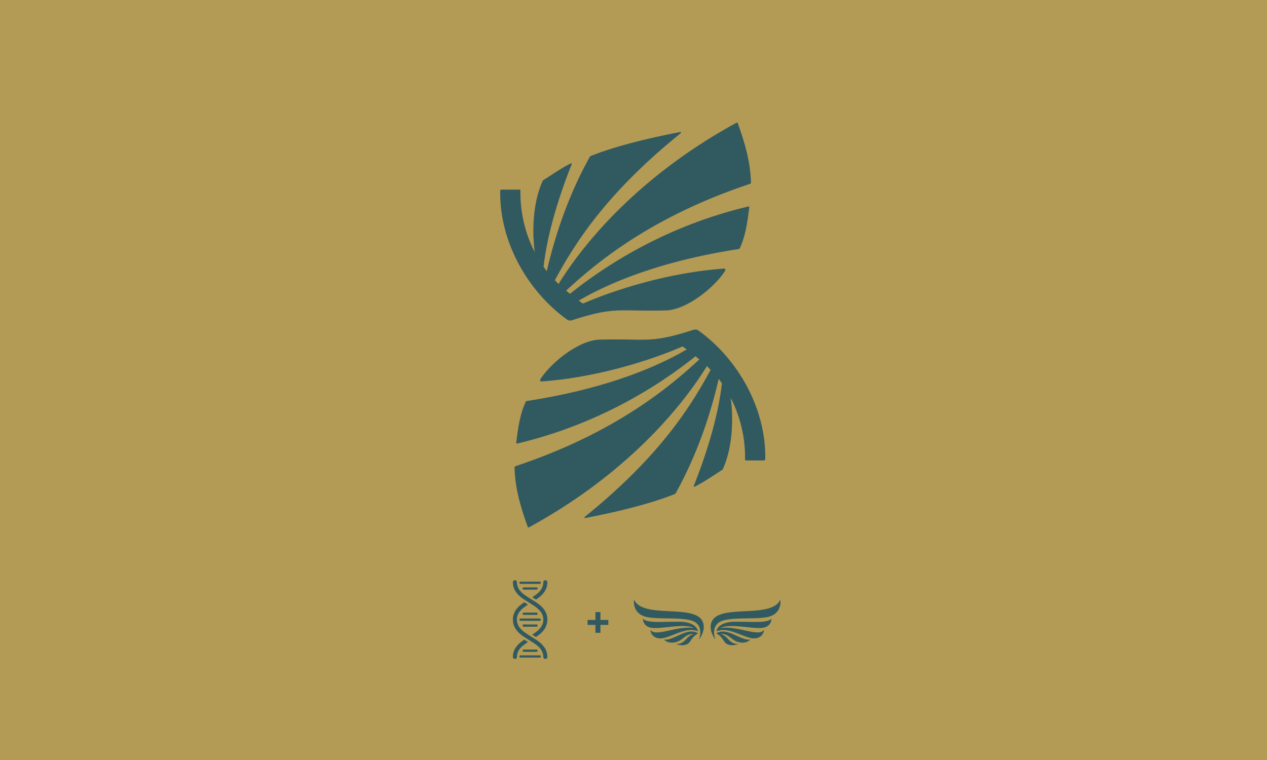
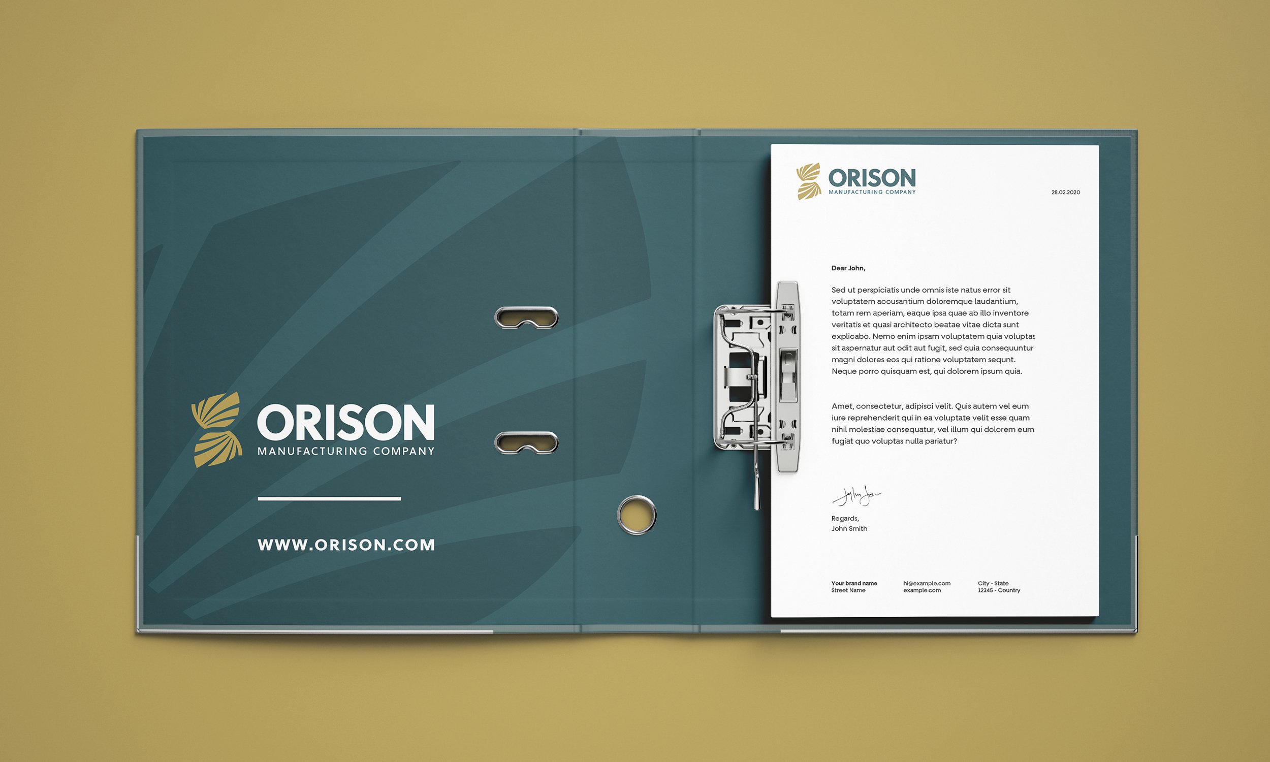
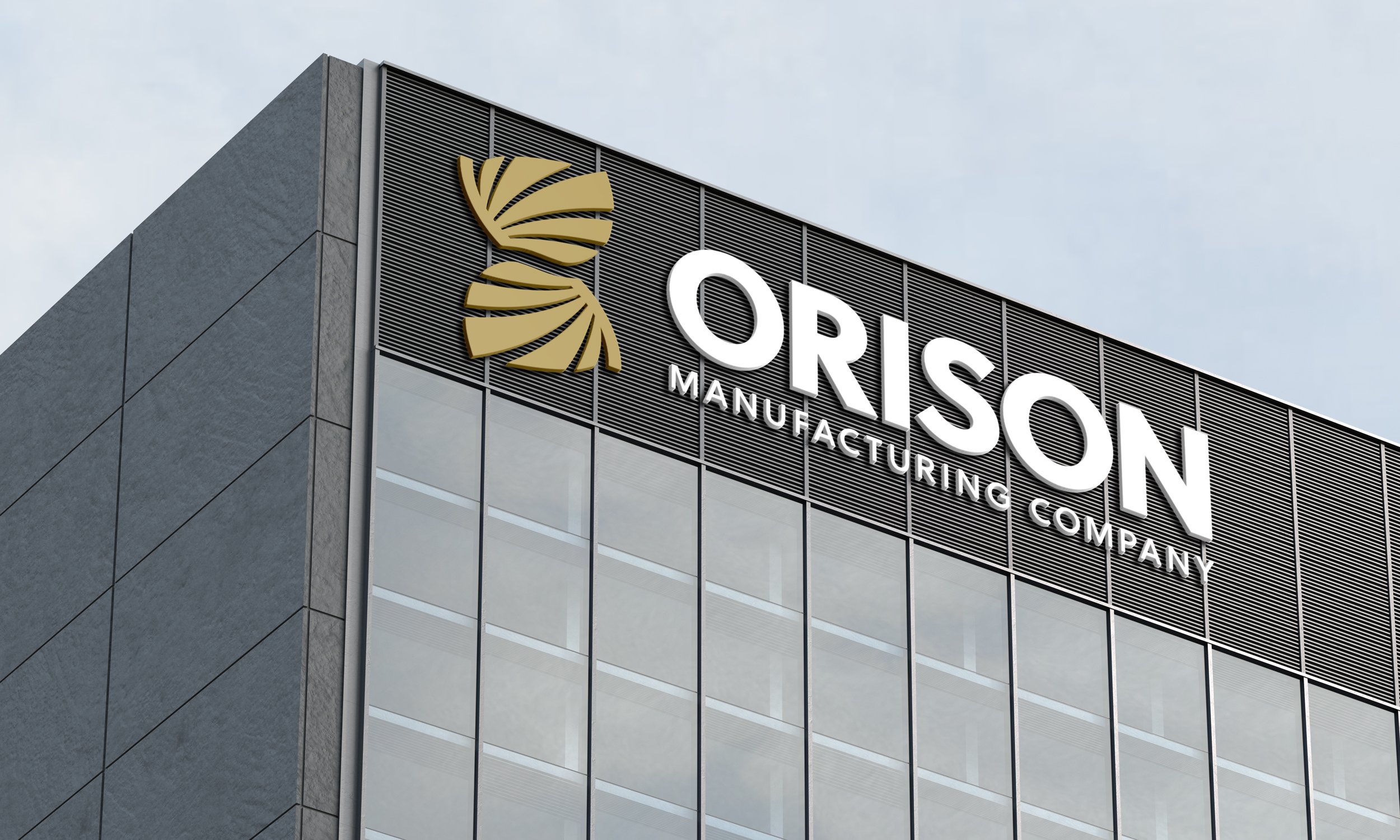
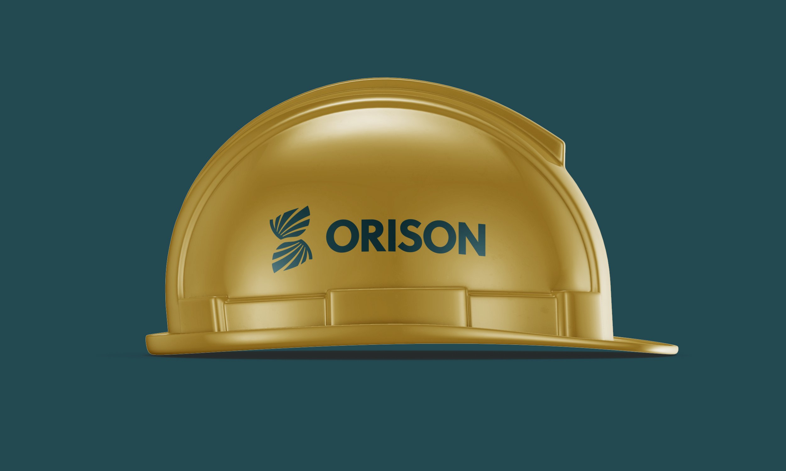
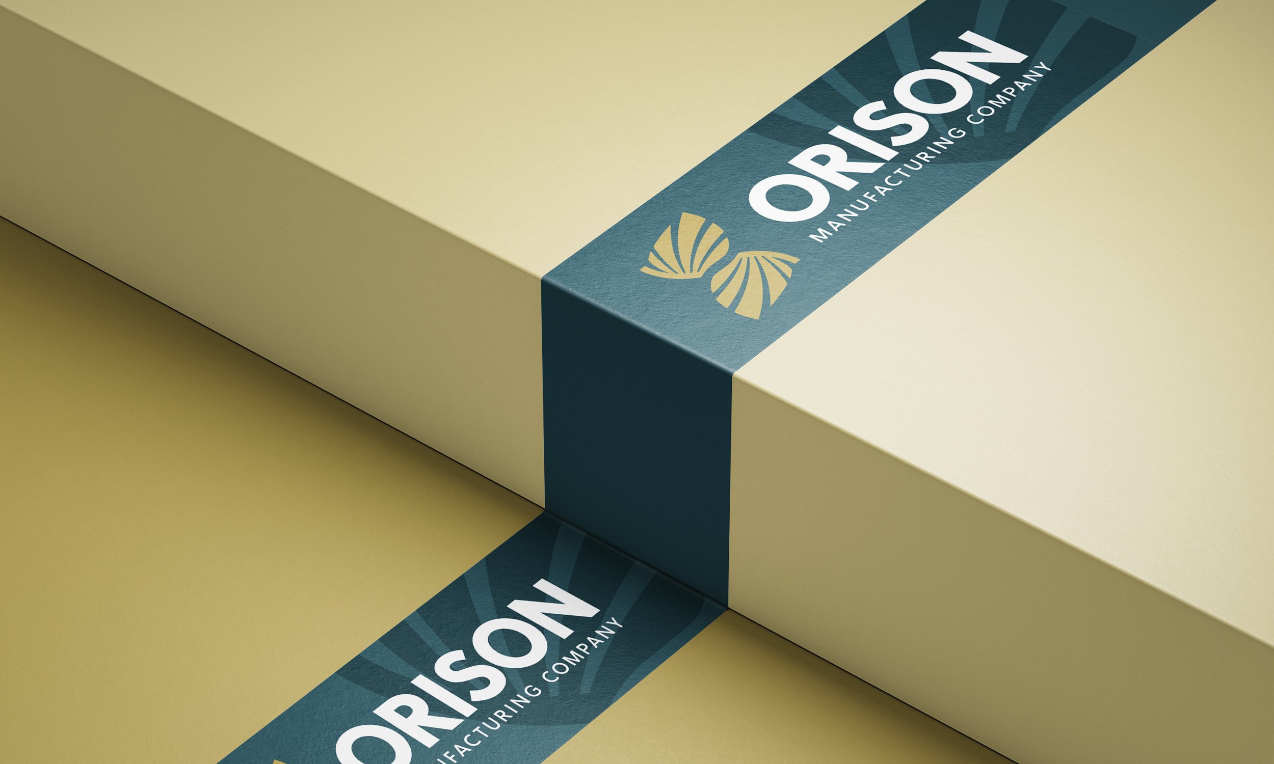
The solution was a modern mark that combines the structure of a DNA helix with the form of wings — a symbol that references both scientific precision and the company's faith-driven mission. The abstract approach keeps the logo professional and forward-looking while allowing the symbolism to work on multiple levels. The result is a clean, scalable identity that works across packaging, technical documentation, digital platforms, and manufacturing environments — positioning Orison as a trustworthy, values-driven partner in pharmaceutical manufacturing.
The Challenge: Entering a Regulated Industry
Pharmaceutical manufacturing demands absolute trust. When companies are selecting a contract manufacturer for critical healthcare products, they're evaluating far more than capabilities — they're assessing credibility, compliance, values, and long-term reliability. For Orison Manufacturing, entering this industry with a new company name meant their brand identity would be doing critical work from day one.
The logo needed to communicate scientific precision and regulatory sophistication without feeling cold or corporate. It also needed to subtly reflect the company's Christian values in a way that felt authentic and appropriate for a B2B manufacturing environment. Too overt and it would alienate potential clients; too subtle and it wouldn't serve as the values-driven differentiator it was meant to be.
The Approach: Symbolism with Strategic Purpose
The DNA helix references pharmaceutical science, precision, and the molecular-level care required in healthcare manufacturing. The wing form introduces movement, elevation, and protection — concepts that align with both the manufacturing process and Orison's faith-based mission. Together, they create a mark that works on multiple levels depending on the viewer's perspective.
For pharmaceutical clients, the logo signals scientific rigor and manufacturing excellence. For those familiar with Christian symbolism, the wings offer a subtle reference to faith and stewardship. The design allows both readings to coexist without either overwhelming the brand's primary function: establishing Orison Manufacturing as a credible, professional partner in a highly regulated industry where trust is everything.