Xhortation Clothing
Xhortation needed a brand identity that could live in two worlds at once — contemporary streetwear that earns its place on the rack next to secular brands, and a faith statement meaningful enough to inspire the people wearing it. The client's vision was clear: minimalist, unisex apparel rooted in Christian faith, designed for everyday wear without announcing itself. The result had to work on a hoodie hem, a grosgrain ribbon label, a hang tag, and a storefront sign — and it had to do all of that without ever feeling like church merch.
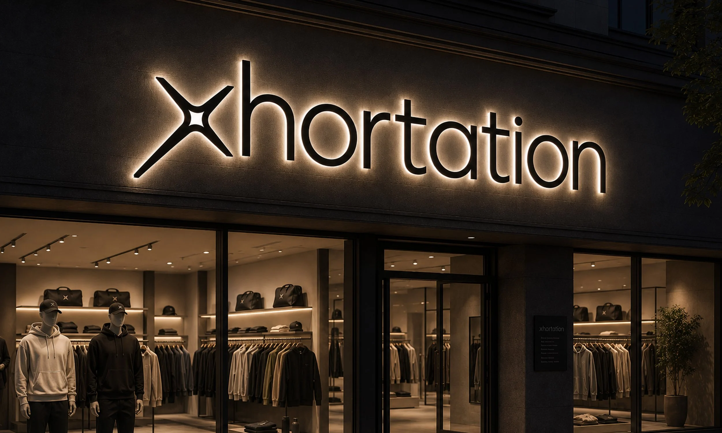
The solution was a wordmark built on a single layered idea: the cross is the X, and the X is the cross. The mark reads as a confident, geometric letterform first — completing the word "exhortation" in the reader's mind — and reveals the cross to those who look closer. The pinched center gives the icon tension and identity without decoration. It's a brand that works in the world and rewards the people who know.
The Challenge: Faith Without the Cliché
The faith-based apparel market is crowded with imagery that signals its intent immediately — crosses, doves, scripture in decorative type. For Xhortation's target audience of Gen Z and millennial Christians, that visual language is exactly what they're trying to avoid. They want to wear their faith, not announce it. They want to share it through conversation, not a billboard.
The challenge was designing a brand identity with genuine Christian meaning at its core that could stand alongside streetwear brands like Aviator Nation and Henry Dry Goods without looking out of place. The mark needed to be subtle enough for someone who doesn't know to simply see a well-designed wordmark — and layered enough that discovering the cross feels like a reward, not an afterthought.
The Approach: X First, Cross Second
The entire identity system was built around a deliberate hierarchy: the wordmark reads as "xhortation" first, which the mind naturally completes as "exhortation." The cross is embedded in the X mark — present from the beginning, but earned through attention. This "if you know, you know" mechanic is the strategic foundation of the brand, not a design flourish.
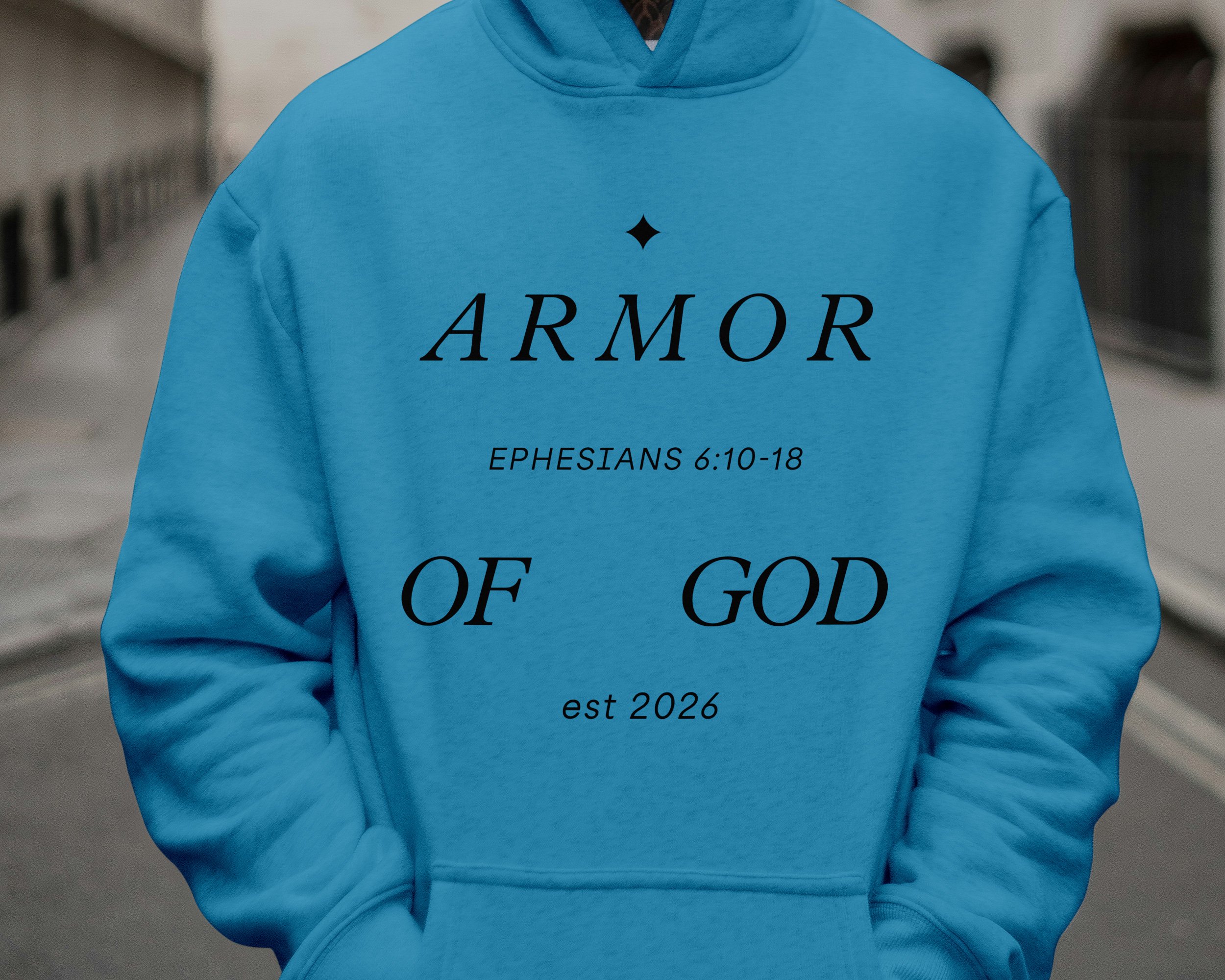
The mark was tested across every production context the client specified — embroidery at hem and sleeve scale, grosgrain ribbon labels, hang tags, and screen printing across eight garment colorways. A simplified version was developed for sub-one-inch applications where the pinched center detail fills in. The final system gives Xhortation a brand that holds its meaning at every size, on every surface, and in every space it enters — faith-rooted, streetwear-ready, and built to last.