
Monday Creative Prompt: The Word on Your Table — Typography You Can Touch
Every week, I share a creative prompt to help you reconnect with making things. Not for clients. Not for portfolios. Just for you. This week's prompt is about slowing down, getting your hands dirty, and remembering that design existed long before screens did. Welcome back.
There's this moment that happens sometimes on Monday mornings. You sit down at your desk, open your laptop, and stare at the screen waiting for inspiration to show up. You toggle between tabs. You scroll through Pinterest or Behance looking for that spark. You open a blank Illustrator file and the cursor just blinks at you, demanding something you're not sure you have right now. I've been there more times than I can count. And I've learned something about those mornings: sometimes the problem isn't that you don't have ideas. It's that you're looking for them in the same place you always do.
So this week, I'm asking you to do something different. Close the laptop. Walk away from the screen. And head to your kitchen.
What's Already on Your Table
Before you check email, before you dive into your to-do list, before you do anything else today, I want you to just stand in your kitchen for a minute and look at what's around you. There's probably a bowl of fruit on the counter. Maybe some coffee beans in a jar. A few sprigs of herbs you bought for dinner last week. A lemon you forgot about. Some scattered blueberries in the fridge. Leaves from the yard tracked in on someone's shoes. Nothing special. Nothing you'd call "art supplies." Just the ordinary stuff of everyday life.
Now here's what I want you to imagine: instead of opening a new design file this morning, what if you built a word right there on your kitchen table? Not with pixels. Not with vectors. With your hands. With what's already around you. A handful of coffee beans arranged into a curve. A lemon sliced thin to form a letter. Rosemary sprigs laid carefully to spell something that matters. Blueberries scattered into a word that's been sitting in the back of your mind all week.
That's this week's prompt. And I promise you, it's going to feel different than anything you've made in a while.
Why Food? Why Now?
I know what you might be thinking. You're a designer. You work in Figma and Illustrator and Photoshop. You know your way around kerning and leading and all the technical details that make typography work. So why would you spend time arranging leaves on a table? Because creativity wasn't always this clean. Before typography lived inside font menus and before we could nudge anchor points by decimal places, letters were physical things. They were carved into wood. Pressed into metal. Painted onto surfaces. Stitched into fabric. People shaped words with their hands, and every letter carried the mark of the person who made it. And somewhere along the way, as design became more digital and more precise, we lost some of that tactile connection. We stopped feeling the weight of letters. We stopped noticing texture and shadow in the way our hands would naturally understand them. Everything became perfect, aligned, optimized. Which is great for client work. But it's not always great for our creative souls.
This prompt is about reconnecting with that earlier version of design. The version where your hands did the thinking. Where imperfection wasn't a mistake to fix—it was part of the story. And food? Food is honest. It doesn't pretend to be anything other than what it is. Strawberries bruise. Coffee grounds won't hold a sharp edge. Rice shifts if you breathe too hard near it. And that vulnerability, that temporary fragility, is exactly what makes this kind of work so compelling. You're not trying to control every variable. You're working with materials that have their own personality, their own way of existing in space. You're collaborating with the medium instead of commanding it.
The Word You Choose Matters
So here's where you start: choose one word. Just one. Not a sentence. Not a phrase. One word that feels true to where you are right now. Maybe it's a word you've been thinking about lately. Maybe it's a word you need to hear. Maybe it's a word that keeps showing up in conversations or in your own thoughts, asking for attention. Some words that might resonate: Grow. Enough. Patience. Begin. Home. Courage. Return. Abide. Rise. Bloom. Rooted. Wild. Or maybe it's your own name. Or the name of something you're building. Or a word that connects to a personal project you've been putting off because you haven't had time or energy or permission to start it yet. Sit with the word for a minute before you do anything else. Let it settle. Ask yourself: what does this word feel like? Not what does it mean in a dictionary sense, but what does it feel like to you? Because once you know the feeling, you'll know what materials to use. If the word is "Courage," maybe it needs the boldness of red chili peppers. If it's "Calm," maybe it wants the softness of chamomile flowers or smooth stones. If it's "Abide," maybe thick slices of bread feel right—something substantial, something that nourishes. If it's "Rise," maybe yeast bubbles in dough or seeds scattered upward will carry that energy.
This is where you get to be both a designer and a storyteller. You're translating emotion into texture. You're making a visual choice that goes deeper than aesthetics—it's about meaning.
Building the Word (And What Happens When You Do)
Here's what the actual process looks like, and I want to walk you through it because the experience of making this is just as important as the final photograph. You clear a space on your table. You gather your materials. And then you start laying them down, one piece at a time, forming the first letter. Let's say you chose the word "Grow" and you decided to build it out of fresh basil leaves. You pick up the first leaf and place it. Then another. You're shaping a "G" with your fingertips, adjusting the curve as you go. You add one more leaf to strengthen the stroke. You remove another because it feels too heavy. And without realizing it, something shifts.
You're designing the way you did before you knew all the rules. Intuitively. Carefully. Playfully. You're not thinking about grids or alignment or whether this would work in a brand guideline. You're just making something, the way kids make things before anyone tells them there's a right way and a wrong way. Then you move to the "R" and the leg of the letter collapses. It doesn't sit right. You try again. Still awkward. For a second, frustration creeps in. Because you're used to having control. You're used to being able to undo and redo and adjust until it's perfect.
But then you remember: leaves weren't meant to behave like vectors. Basil doesn't have anchor points. And maybe—maybe—the imperfection is the entire point. So you let it stay. You let the awkward leg be awkward. And suddenly the letter feels more honest. More human. More alive. That's when you realize this isn't just a design exercise. It's a meditation on control and imperfection and the beauty of things that don't last forever.
What This Actually Does for Your Creative Brain
If you've been feeling stuck lately—if client work has started to feel repetitive, if your portfolio feels safe instead of exciting, if you've been doubting whether you still have good instincts—this prompt is for you. Not because it's going to produce portfolio-worthy work (though it might). But because it reminds you of something essential: you are still capable of making things. Without a brief. Without approval. Without anyone's permission. You don't need a client to spell "Hope" in blueberries. You don't need a deadline to form the word "Future" out of rosemary sprigs. You just need curiosity and a willingness to try something that might not work.
And that willingness—that openness to failure, to messiness, to imperfection—is the exact thing that makes your client work better too. Because the designers who create the most compelling brand identities aren't the ones who play it safe. They're the ones who understand how to balance precision with humanity. Structure with soul. Control with intuition. When you build typography out of food, you're practicing all of those things at once. You're training your eye to see form and balance without relying on software to tell you when something is "correct." You're learning to trust your instincts again. And you're giving yourself permission to make something beautiful that doesn't have to serve any purpose other than existing for a little while on your kitchen table.
Photographing It Like It Matters
Once your word is formed, don't rush to clean it up and move on with your day. Treat it like it's a real project. Because it is. Step back and look at it the way you'd look at a campaign concept. Notice how the light is hitting it. Notice the texture—the way coffee grounds catch shadows differently than lemon slices, the way rosemary casts delicate lines across the surface. Notice the tiny imperfections that make it feel handmade instead of manufactured. Then photograph it. Slowly. Thoughtfully. Change your angle. Get close enough to see the details—the rough edge of a torn leaf, the way rice grains cluster together in the curve of a letter. Pull back and show the whole composition in context on the table. Try shooting from directly above for a clean, editorial look. Try shooting from the side to capture shadow and dimension. Try letting some of the word fall out of focus so the viewer's eye has to work a little to complete the form. And when you look at the final images, ask yourself the question that lives at the heart of all great branding work: What does this feel like? Not "Is this perfect?" Not "Would a client approve this?" But "What does this feel like?"
Because that feeling—that emotional resonance—is what separates forgettable design from work that sticks with people. And the more you practice noticing feeling in your personal creative projects, the more instinctively you'll be able to bring it into your professional work.
This Isn't About Impressing Anyone
I want to be really clear about something: the goal of this prompt is not to produce content for your Instagram feed. It's not about getting likes or building your following or proving to anyone that you're still "creative enough." The goal is to reconnect with the part of you that made things before there were stakes attached to making them. Before invoices and revisions and client feedback and metrics, there was just the simple joy of watching something take shape under your hands. The surprise of realizing you made something beautiful out of completely ordinary materials. A lemon. A few coffee beans. A handful of leaves from the yard. If you're in a season where creative work has started to feel heavy—where every project feels like it's attached to your worth or your income or your future—this is your permission slip to make something just because. To spend twenty minutes on a Monday morning arranging blueberries into a word that no one will ever see except you. That act, small as it sounds, is radical. Because it reminds you that your creativity doesn't belong to clients or algorithms or anyone else. It belongs to you. And you get to use it however you want, whenever you want, for whatever reason makes sense to you in that moment.
Your Invitation
So here it is. Your Monday prompt.
Create a piece of typographic art using only food or natural materials. Choose one meaningful word. Form it by hand. Photograph it thoughtfully.
That's it. You don't need to share it. You don't need to explain it. You don't even need to keep it—in fact, part of the beauty is that you can't keep it. Food spoils. Leaves dry out. Coffee grounds get swept away. The work is temporary, which means you get to make it without the pressure of it needing to last forever. And when you're done, when you've taken your photos and cleaned up your table and gone back to your regular work, I want you to notice something: Do you feel different? Do you feel a little lighter? A little more awake? A little more connected to why you wanted to do this kind of work in the first place? That feeling is what I'm after. Not a finished product. Not a perfect image. Just that quiet shift that happens when you stop performing and start creating.
If you make something, I'd love to see it. Share it in the comments, tag me, send it my way. These prompts are always better when they become conversations instead of one-way assignments. And if you want these Monday prompts delivered to your inbox every week so you never miss one—plus occasional thoughts on branding, creativity, and what it takes to build work that actually means something—you can sign up for my newsletter. No fluff. No sales pitches. Just the kind of email you'd actually want to read on a Monday morning. Now go find a word. And build it with your hands.
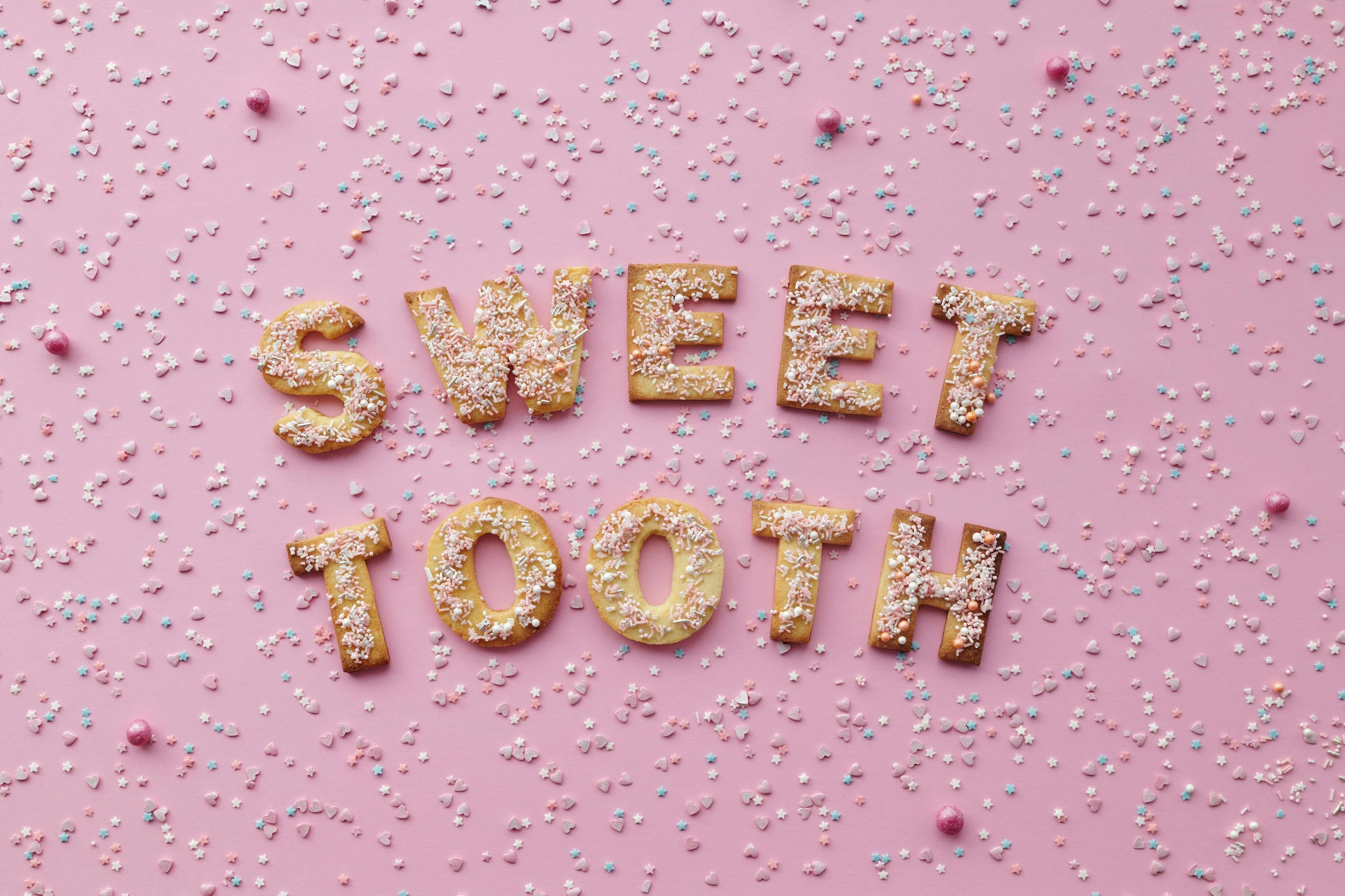
Photo by Henri Mathieu-Saint-Laurent: https://www.pexels.com/photo/flat-lay-of-letter-shaped-cookies-5898214/
Photo by Anna Shvets: https://www.pexels.com/photo/eggshells-in-the-shape-of-an-e-4045567/