
Monday Prompt: Myths in Miniature — Designing Pictogram Logos from Legendary Creatures
Every Monday, I share a creative prompt to help you reconnect with design thinking and making things. This week, I went first. I designed the thing I'm asking you to design, and I'm sharing it right here so you can see the thought process behind turning myth into mark. Welcome back.
I've always been fascinated by the challenge of reduction. Not simplification—that's different. Simplification implies you're making something easier to understand by dumbing it down. Reduction is about distilling something complex down to its absolute essence while keeping all the meaning intact. It's about finding the core truth of a thing and expressing it with the fewest possible elements. That's what great logo design does. And that's what this week's prompt is all about.
I Went First (And Here's What I Made)
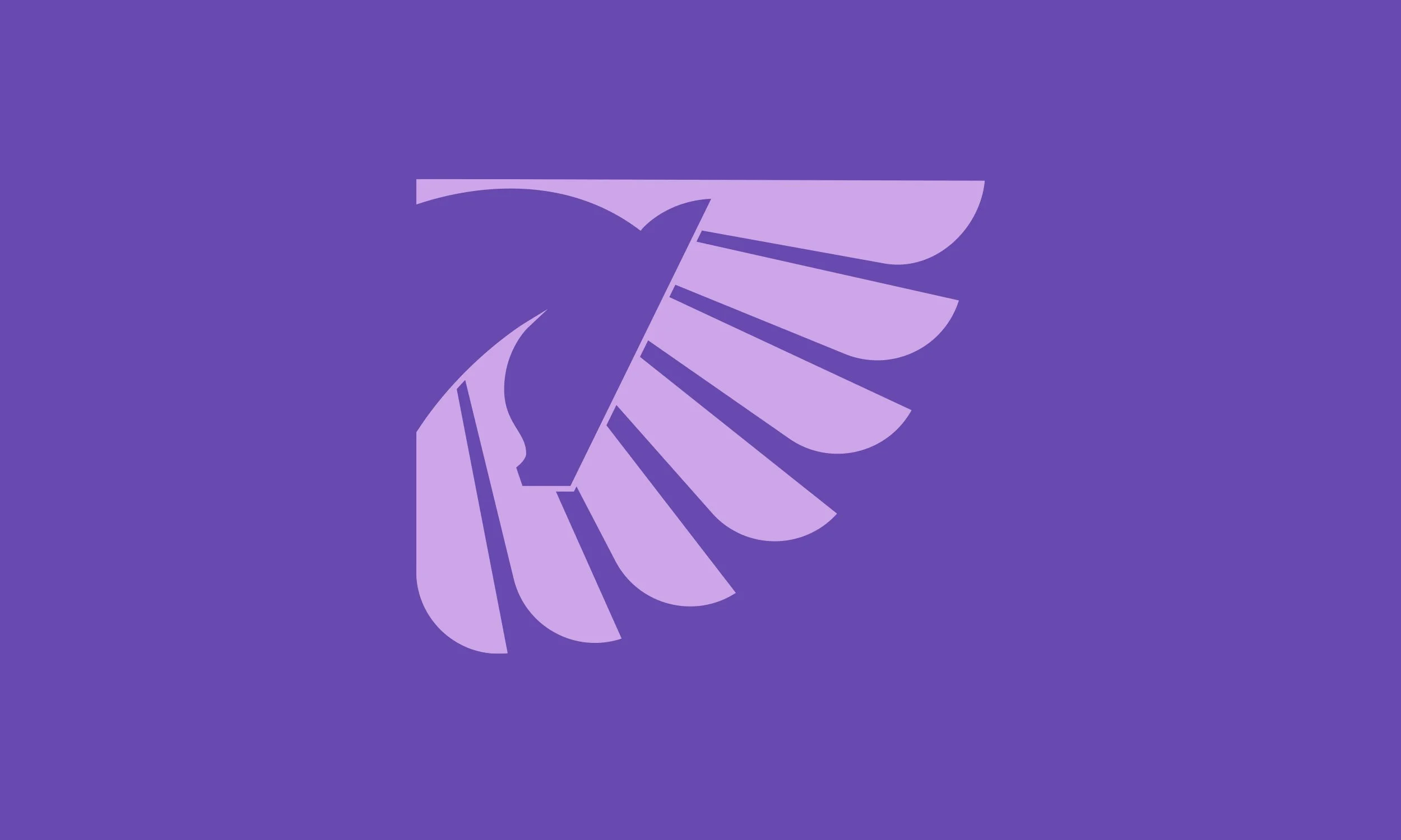
Before I ask you to design anything, I want to show you what I created—not because it's perfect or because there's only one right way to do this, but because seeing someone else's process makes it easier to trust your own. The image you're looking at is my pictogram logo of Pegasus, the winged horse from Greek mythology. It's built from simple geometric shapes—curves, lines, and negative space—set against a dark navy background with a bold orange-to-coral gradient filling the form. Here's what I want you to notice: you can immediately tell what it is. Even though it's been reduced to maybe eight or nine core shapes, your brain recognizes it as a winged horse in mid-flight. The wing is stylized into distinct feathers that radiate outward. The head and neck curve forward in a way that suggests motion and grace. The body is implied rather than fully rendered—just enough information for your eye to complete the form. This is the power of pictogram design. You're not drawing the thing. You're designing the idea of the thing. You're asking: what is the minimum visual information I need to give the viewer for their brain to fill in the rest? For Pegasus, the answer was: wings and movement. Because without wings, it's just a horse. And without the sense of flight, it's just a bird. But together—a horse in motion with feathered wings reaching back—that's unmistakably Pegasus.
Why Mythological Creatures? Why Pictograms?
Let me tell you why I think this particular combination is such a rich creative exercise, especially if you're trying to strengthen your design instincts or get back into making things after a break.
First, mythological creatures are inherently symbolic. They're not just animals—they represent ideas. A dragon represents power, danger, ancient wisdom. A phoenix represents rebirth and resilience. A griffin represents the union of earth and sky, strength and vigilance. When you design a logo around a mythological creature, you're not just depicting a form—you're translating meaning. And that's exactly what good branding does.
Second, pictograms force clarity. You can't hide behind details or rendering or photorealism. Every shape has to earn its place. Every curve has to communicate something essential. If an element isn't pulling its weight, it shows immediately. This constraint is incredibly valuable because it trains your eye to see what matters and cut away what doesn't.
Third, this is a design problem with built-in boundaries. You have a subject (a mythological creature). You have a format (pictogram). You have a goal (instant recognition). Those constraints give you direction without boxing you in. And paradoxically, constraints like these often lead to more creative solutions than total freedom does.
Choosing Your Creature
The first step is deciding which mythological creature you want to work with. And this matters more than you might think, because different creatures present different design challenges. Some creatures are defined by a single distinctive feature:
Unicorn = horse + horn
Medusa = human + snake hair
Minotaur = human body + bull head
Mermaid = human upper body + fish tail
These are great starting points because the "hook" is obvious. You know exactly what element makes the creature recognizable. Other creatures are more about combining multiple animal traits:
Griffin = eagle head + lion body
Sphinx = human head + lion body + sometimes wings
Chimera = lion + goat + serpent
Dragon = reptile + wings + sometimes multiple heads
These are trickier because you have to balance multiple elements without making the design feel cluttered or confusing. And some creatures are more about symbolism or transformation:
Phoenix = bird + flames
Kraken = giant octopus/squid
Cerberus = three-headed dog
Pegasus = horse + wings (which is what I chose)
Pick whichever creature speaks to you. Maybe it's one you loved as a kid. Maybe it's one that connects to a project you're working on or a brand you admire. Maybe it's just one that sounds fun to design. Trust your instinct here—this is your prompt, not mine.
The Design Process: From Myth to Mark
Alright, let's walk through how to actually create this thing. I'm going to share the process I used for my Pegasus logo, but remember: this is a framework, not a formula. Your process might look different, and that's exactly how it should be.
Step 1: Research the creature's defining characteristics.
Before you open Illustrator or grab a pencil, spend a few minutes looking at existing depictions of your chosen creature. Not to copy them, but to understand what makes the creature recognizable across different artistic interpretations. For Pegasus, I noticed that almost every depiction emphasized the wings—specifically, individual feathers radiating outward. The wings weren't just attached to the horse; they were a dominant visual element. I also noticed that the best versions showed motion, either through the angle of the body or the position of the legs.
Step 2: Sketch the core shapes (even if it's just mental sketching).
You don't need to be good at drawing to do this part. You're just identifying the essential geometric forms. Is the head a circle or an oval? Is the neck a curve or a straight line? Are the wings made of triangular feathers or rounded ones?
For Pegasus, I broke it down like this:
Head = curved triangular shape pointing forward
Neck = smooth S-curve
Wing = series of overlapping curved shapes radiating backward
Body = implied through negative space and the connection points
Step 3: Start building in your design software (or on paper).
Open your tool of choice—Illustrator, Figma, Affinity Designer, even just a piece of paper and a marker—and start placing shapes. Don't worry about getting it right on the first try. This is an iterative process. I started with the wing because I knew that was going to be the most visually dominant element. I created one feather shape, duplicated it, rotated each copy slightly, and adjusted the sizes to create that radiating effect. Then I added the head and neck, positioning them so the creature felt like it was in motion, leaning into flight.
Step 4: Refine through subtraction.
This is where the real design work happens. You've built your first version, and now you need to ask: what can I remove without losing recognition? Can you simplify the feather shapes? Can you remove a line and let the negative space imply it instead? Can you merge two elements into one more elegant form? I went through probably a dozen iterations before landing on the version I'm sharing. Each time, I removed something or simplified a curve. The goal was to get to the point where removing one more element would make it unrecognizable.
Step 5: Choose your color palette.
Pictograms often work best in one or two colors, but you can add visual interest through gradients or subtle color shifts. For Pegasus, I used a warm orange-to-coral gradient against a dark navy background. The contrast makes the form pop, and the warm tones give it energy and movement. Think about what your creature represents and let that guide your color choices. A phoenix might be red-orange-yellow (fire). A kraken might be deep blue-green (ocean depths). A dragon might be dark red or emerald green (power, ancient magic).
Step 6: Test it at different sizes.
A good pictogram logo should be recognizable at any size—from a tiny favicon to a billboard. Zoom out. Shrink it down. Does it still read clearly? If not, simplify further.
What This Exercise Actually Teaches You
Let me be honest about what's really happening when you design a pictogram logo like this. You're not just making a pretty picture. You're training yourself to think like a brand designer. You're learning how to identify the essence of an idea and communicate it visually with absolute economy. You're practicing the skill of reduction—knowing what to keep and what to cut. You're understanding how shape language communicates meaning before color, before typography, before any other element enters the frame. These are the foundational skills that separate designers who make things that look nice from designers who make things that work. Things that communicate instantly. Things that stick in memory. Things that carry meaning across cultures and contexts. And here's the beautiful part: you don't need a client brief or a deadline or anyone's approval to practice this. You just need a mythological creature, a design tool, and an hour of focused work.
If You're Feeling Stuck or Rusty
Maybe you're reading this and thinking, "That sounds great, but I haven't designed anything in months" or "I'm not sure my skills are sharp enough for this." Let me tell you something: this prompt is for you. It's for the designer who's been doing client work on autopilot and forgot what it feels like to design something just because it's interesting. It's for the creative who's been doubting their instincts because everything has to be justified to stakeholders. It's for the person who wants to get back into design but doesn't know where to start. You start here. With a creature from a story. With simple shapes. With a challenge that has clear boundaries but infinite solutions. You don't need to share it with anyone. You don't need it to be portfolio-worthy. You just need to make it. And in making it, you'll remember that you know how to do this. You'll remember that design is problem-solving, and problem-solving is satisfying when you let yourself engage with it honestly.
The Bigger Picture: Myth as Brand
There's a reason so many brands use mythological creatures in their logos. Nike (the winged goddess of victory). Starbucks (a two-tailed siren). Maserati (Neptune's trident). These aren't random choices. These are brands understanding that mythology carries cultural weight, instant recognition, and symbolic power that pure abstraction can't match. When you design a pictogram of a mythological creature, you're tapping into stories that have survived for thousands of years. You're connecting to archetypes that resonate across cultures. You're practicing the same kind of symbolic thinking that the best brand designers use every day. And even if you never use this exact logo for anything, the skills you're building—reduction, symbolic thinking, shape language, visual hierarchy—will show up in every other design project you touch.
Your Assignment
Here it is. Your Monday prompt.
Design a pictogram logo inspired by a mythological creature. Reduce it to its essential forms. Make it instantly recognizable. Make it mean something.
Choose your creature. Research its defining traits. Start with simple shapes. Refine through subtraction. Pick colors that amplify the meaning. Test it at different sizes. And when you're done, step back and ask yourself: does this feel like the creature? Does it capture not just what it looks like, but what it represents? If the answer is yes, you've done the thing. You've translated myth into mark. You've reduced complexity to clarity. You've designed something that communicates instantly. That's the work. That's the practice. That's what keeps your design instincts sharp.
Share Your Creatures
If you design a mythological pictogram logo for this prompt, I genuinely want to see it. Tag me, drop it in the comments, send it my way. I'm always curious to see which creatures people choose and how they solve the design challenges differently than I did. And if you want these Monday prompts delivered to your inbox every week—plus occasional thoughts on design, branding, and what it takes to make work that actually matters—you can sign up for my newsletter. It's free, it's short, and I promise it won't waste your time. Now go pick your creature. And design something legendary.