
Branding Case Study: How a Georgia Painting Contractor Built Trust Before the First Call
If you've ever Googled "logo designer near me" or typed "how do I rebrand my small business" into a search bar at midnight, you're not alone. For a lot of business owners — especially contractors and service providers — branding feels like a luxury they should want but aren't sure how to justify. They know their current logo isn't doing them any favors. Maybe it's something they threw together years ago, or something a cousin designed for free. It doesn't look bad exactly. It just doesn't look like them — or worse, it doesn't look like anything at all.
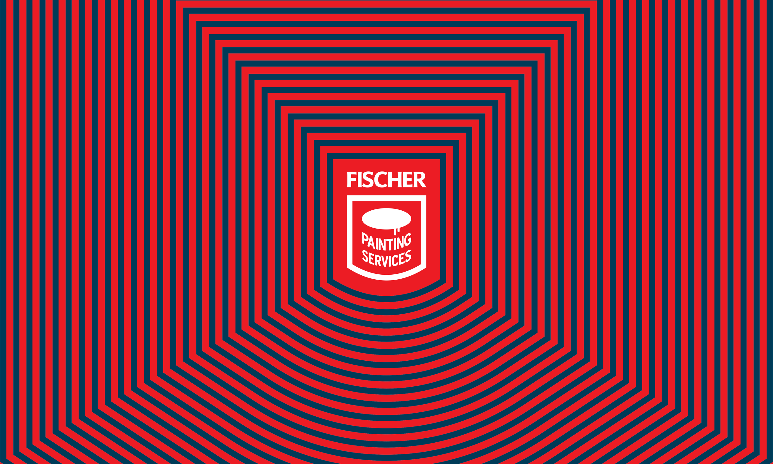
Here's what I want you to understand before we get into the case study: the most valuable thing a logo can do is communicate clearly. Not dazzle. Not impress other designers. Communicate — to the right people, in the right moment, instantly. And the most reliable way to do that? Simplicity. Not simplicity as a shortcut, but simplicity as a discipline. Simplicity that is earned through strategic thinking, intentional choices, and a deep understanding of how your brand actually lives in the real world. That's exactly what this project was about. And that's exactly where Fischer Painting Services was when we started working together.
The Real Problem Isn't the Logo. It's What the Logo Is Doing — or Not Doing.
Fischer Painting Services operates in Gainesville, Georgia and serves the greater Atlanta area — a competitive residential painting market where homeowners have plenty of options and can afford to be selective. The work speaks for itself. The craftsmanship is there. But when your brand doesn't match the quality of your service, you're fighting an uphill battle before you ever pick up the phone. Here's a truth most business owners don't hear until it costs them a job: people form an opinion about your business before they ever contact you. It happens when they see your truck on the highway. It happens when a neighbor pulls your business card out of a drawer. It happens when your yard sign is still sitting on a lawn two weeks after a job is done, doing free advertising — or doing damage.
And here's the part that surprises most people: a complicated, busy, or "creative" logo doesn't fix this problem. It often makes it worse. When there's too much going on — too many colors, too many details, an icon that needs explaining — the eye doesn't know where to land. The brain can't process it fast enough. The moment passes. The opportunity is gone. Simple branding that is executed with intention does the opposite. It gives the eye a place to land. It communicates confidence. It says: this business knows who they are. And that — before a word is spoken or a number is quoted — is how you earn the right to the next conversation.
For Fischer Painting, the ask was refreshingly clear. He didn't come to me wanting something trendy or abstract. He wanted something that:
Read clearly on yard signage and vehicle decals — legible at a distance, in motion, in any lighting
Looked professional enough to earn trust at the moment of first contact
Felt clean and established — not flashy, not forgettable
Could hold its own in a crowded market without looking like every other painting company in the county
That clarity of vision is actually a designer's gift. When a client knows what they need — even if they can't always articulate exactly how to get there — the work has a north star.
Phase One: Discovery — Understanding the Business Behind the Brand
Before I ever touch a pencil, I spend time in what I call the discovery phase. For some clients, this feels like an unusual first step. They came for a logo; why are we talking about their business goals? The answer is simple: a great logo is a strategic tool, not just a piece of art. It should work for your business, not just look nice on a proposal.
With Fischer Painting, discovery meant understanding not just what they do, but who their ideal client is, what markets they're targeting, and where their brand identity needed to show up in the real world. We talked about the competitive landscape in Gainesville and the Atlanta suburbs. We talked about the difference between competing on price and competing on perceived value. And we talked about the specific, practical places this logo would live — truck doors, magnetic decals, yard signs, business cards, social media profiles, and estimates. That last conversation is critical and often overlooked. A logo that looks incredible in a PDF presentation can fall completely apart on the side of a work van at 60 miles per hour. Real-world application isn't an afterthought — it's a design requirement. For businesses searching for a designer and not sure where to start, I'd encourage you to grab my Brand Clarity Checklist before you reach out to anyone. It walks you through the core questions you should be able to answer before a single concept gets drawn — and it'll save you time, money, and frustration in the process.
Phase Two: Sketching and Development — Where the Thinking Happens on Paper
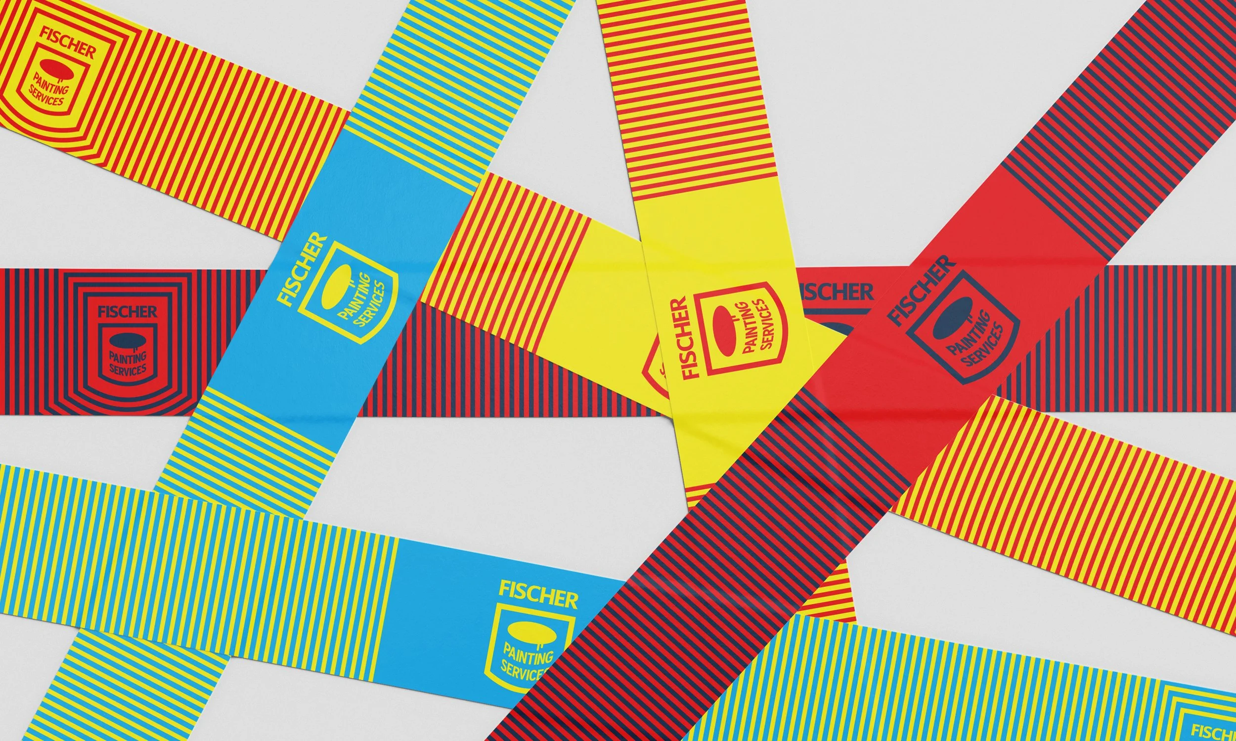
There's a temptation in modern design to skip straight to the screen. I don't. Sketching is where real problem-solving happens. It's fast, it's rough, and it forces creative decisions before software aesthetics get in the way. For Fischer Painting, the sketching phase centered on a core challenge: how do you make a straightforward, text-based logo feel distinctive without overcomplicating it The answer, almost always, is in the details. Letterform choices. Weight and proportion. How the business name breaks across lines. Whether a supporting mark — an icon, a shape, a subtle graphic element — earns its place, or whether the typography itself can carry the load. I explored several directions in this phase, ranging from approaches with illustrative painting elements to strictly typographic marks. What kept rising to the top was simplicity. Not laziness — simplicity with intention. Every version that got more complex got worse. Every version that got cleaner got better.
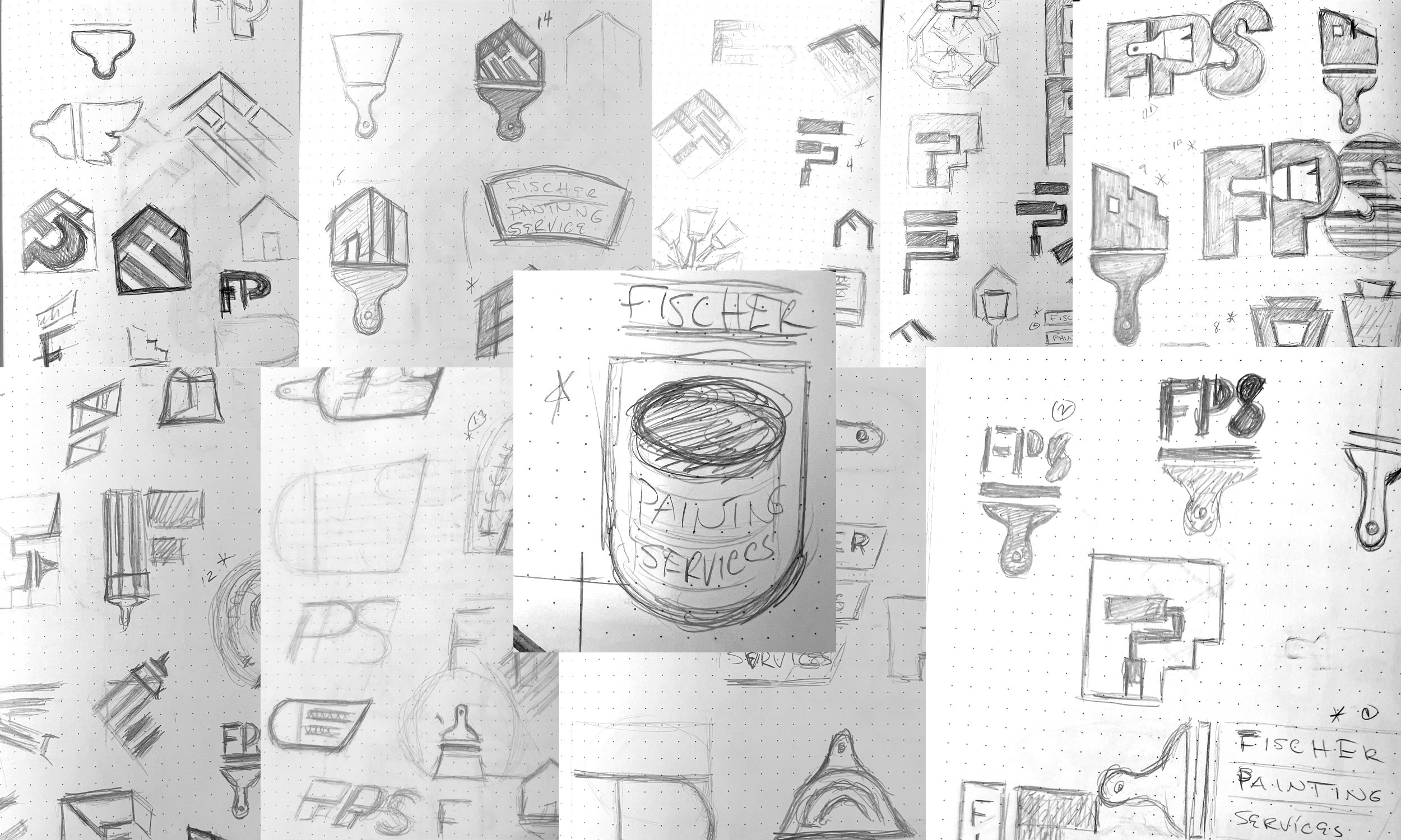
This is something I want every potential client to understand: arriving at something simple is not the easy path. It is the hardest path. It means eliminating every element that isn't doing real work. It means making deliberate choices about every curve, every weight, every bit of spacing — because when there's nothing to hide behind, every decision is visible. Simple design is rigorous design. And that rigor is exactly where the value lives. That's the insight at the heart of this project, and honestly, it's the insight at the heart of most good service business branding: clarity is a form of sophistication. When your brand communicates instantly and confidently, it signals that you run your business the same way.
Phase Three: First Presentation — Showing the Work
The first presentation is a moment I take seriously. It's not a casual email with a few options attached — and it's not a single concept dropped in a client's lap with a "what do you think?" It's a structured, intentional reveal built to make the best decision possible.
Here's how I approach it: I present 15 logo concepts, all in black and white.
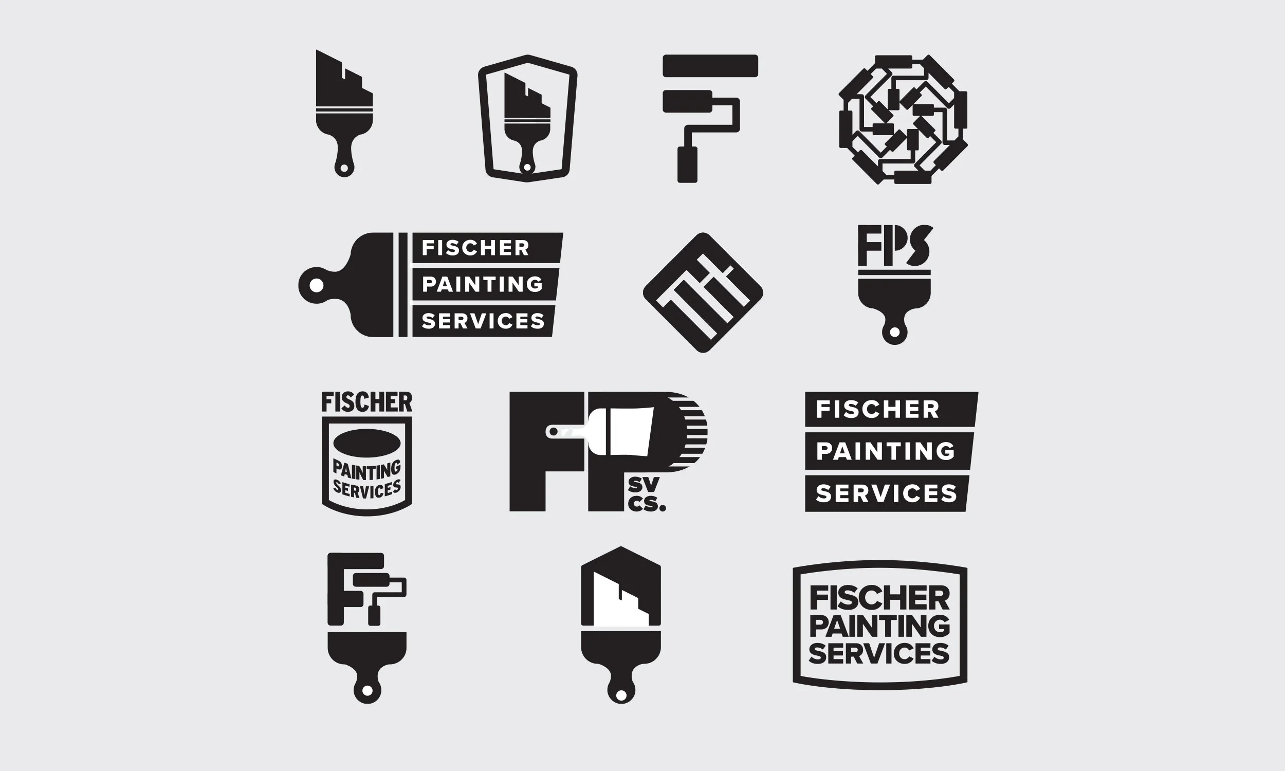
That last part matters more than most people expect. Color is powerful — sometimes too powerful. It can make a weak concept feel strong, or distract from the fact that the underlying mark isn't doing its job. By stripping everything back to black and white at the start, we're evaluating the thing that actually matters most: does the form work? Does it read clearly? Does it communicate the right thing at a glance? If a logo can't hold its own in black and white, color isn't going to save it.
Presenting 15 concepts also means we're not guessing. We're choosing. There's a real range on the table — different directions, different approaches, different ways of solving the same problem — and the client gets to respond to actual work rather than trying to describe something they can only half-imagine. That conversation, the one that happens while looking at real options side by side, is where the best decisions get made.
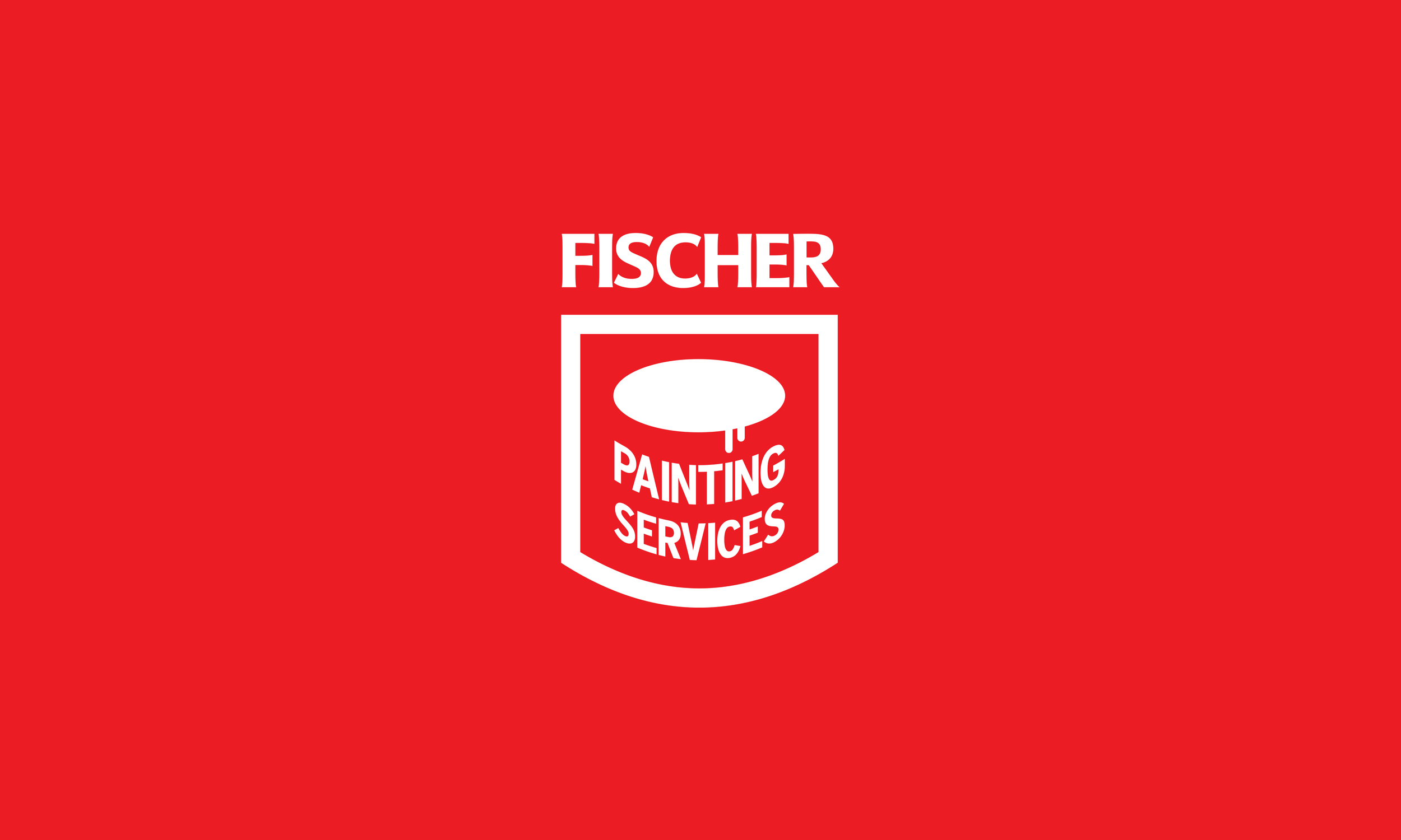
With Fischer Painting, that process did exactly what it's supposed to do. We narrowed from 15 down to the strongest direction — the one that consistently rose to the top for clarity, legibility, and presence. Once we had alignment on the mark itself, we moved into the full visual identity: color palette, typography, and all the real-world applications the brand would need to live in.
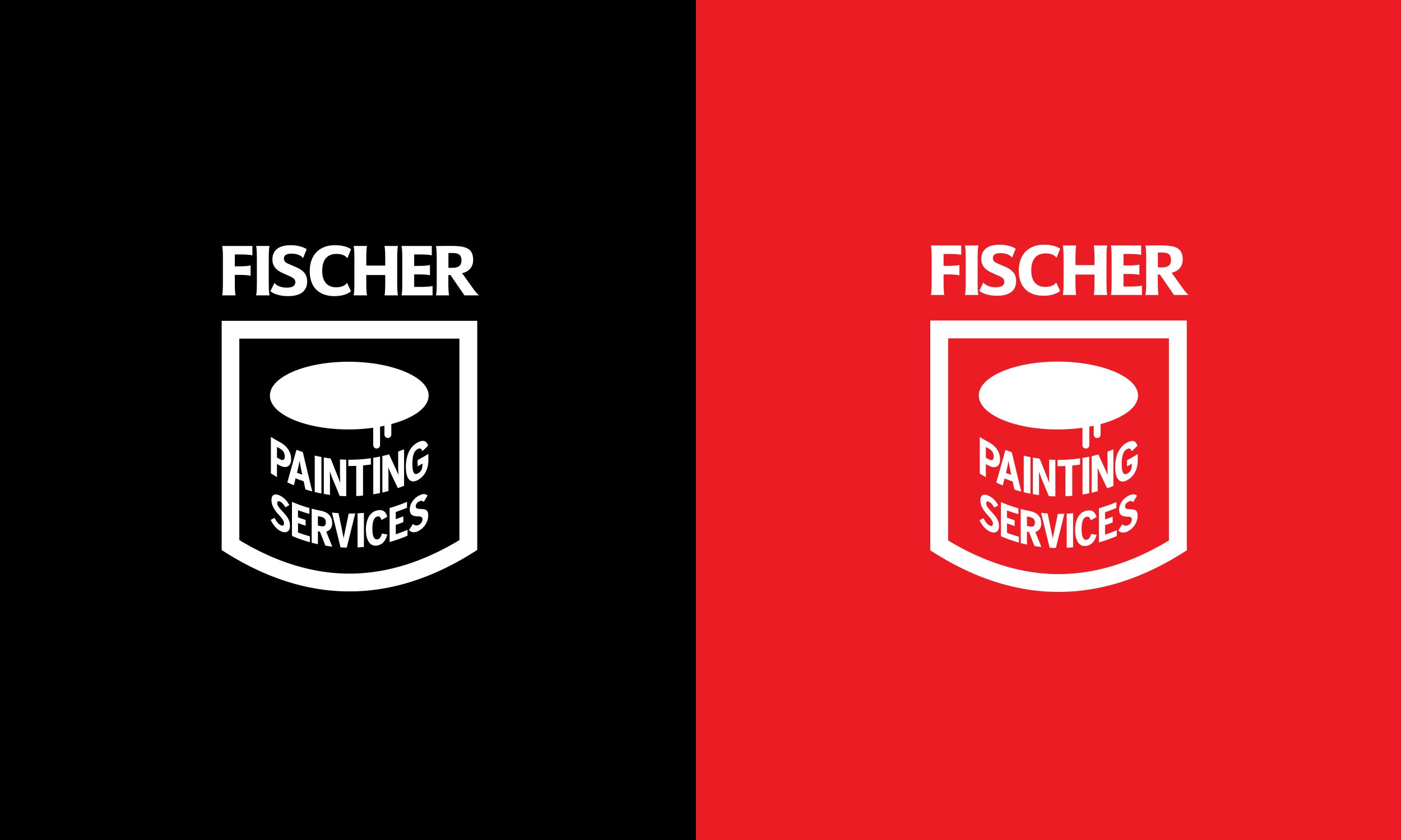
This is where the value of the black-and-white phase becomes obvious. By the time color enters the conversation, we already know the structure is sound. The color isn't carrying the weight — it's enhancing something that already works. The client isn't just looking at a logo at this point. They're seeing a solution. Every element has a reason. The weight of the type was chosen for legibility at distance. The contrast was tested against light and dark backgrounds. The spacing was refined so it breathes at business card size and commands attention at yard sign scale. What looks effortless on screen is the result of a process that was anything but.
The client's response was immediate. It felt right. It felt like the business. That's the goal — not to dazzle someone with something unexpected, but to hand them something that feels like it was always supposed to exist. That feeling of of course is what great simple branding produces. It doesn't call attention to itself. It just works.
Phase Four: Implementation — Building the Brand Identity System
A logo is a starting point, not a finish line. The real value of branding work shows up in implementation — taking a strong mark and building a consistent identity system around it. And this is where simple, functional design pays dividends that complicated branding simply cannot. For Fischer Painting, that meant adapting the core logo into every format the business actually needed:
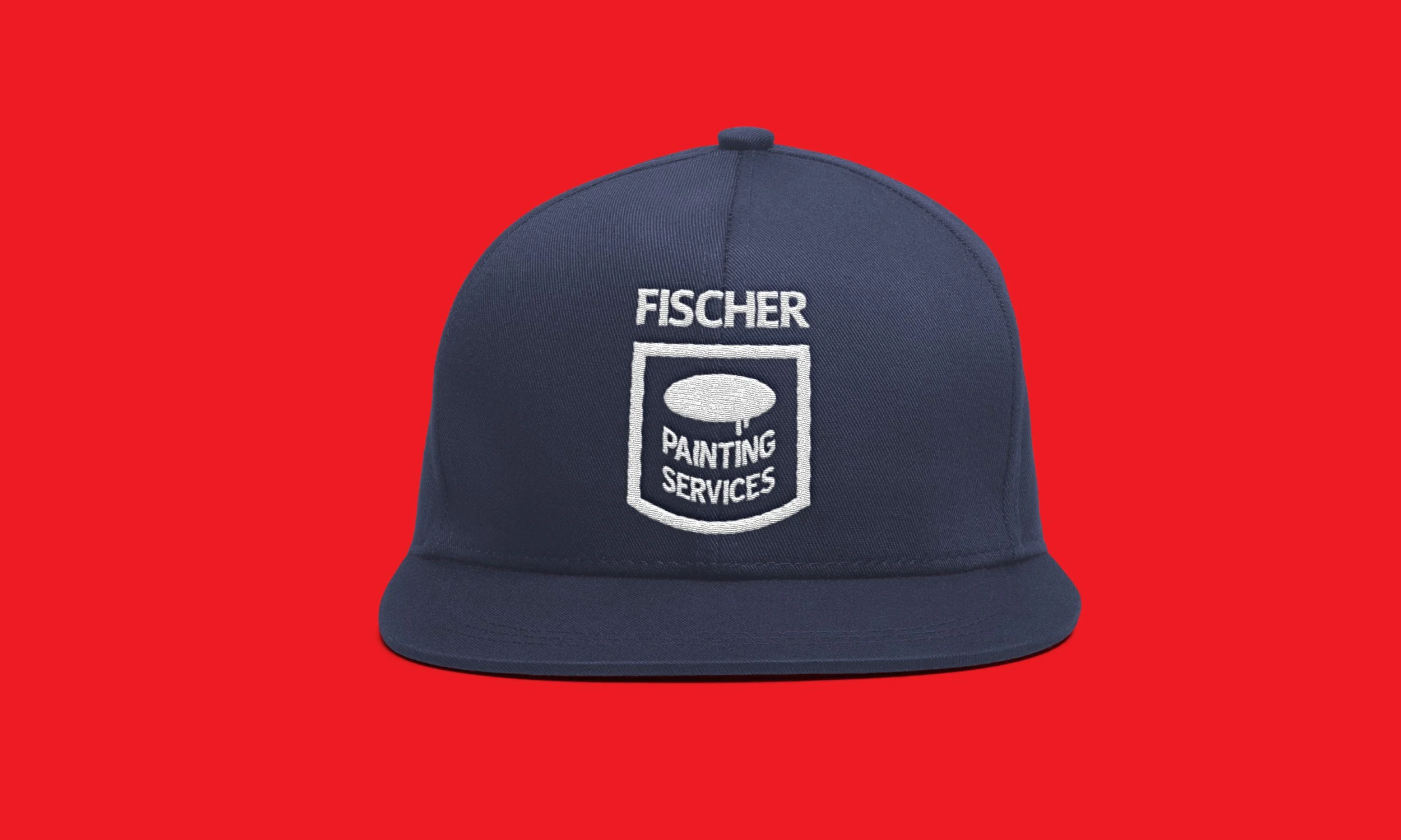
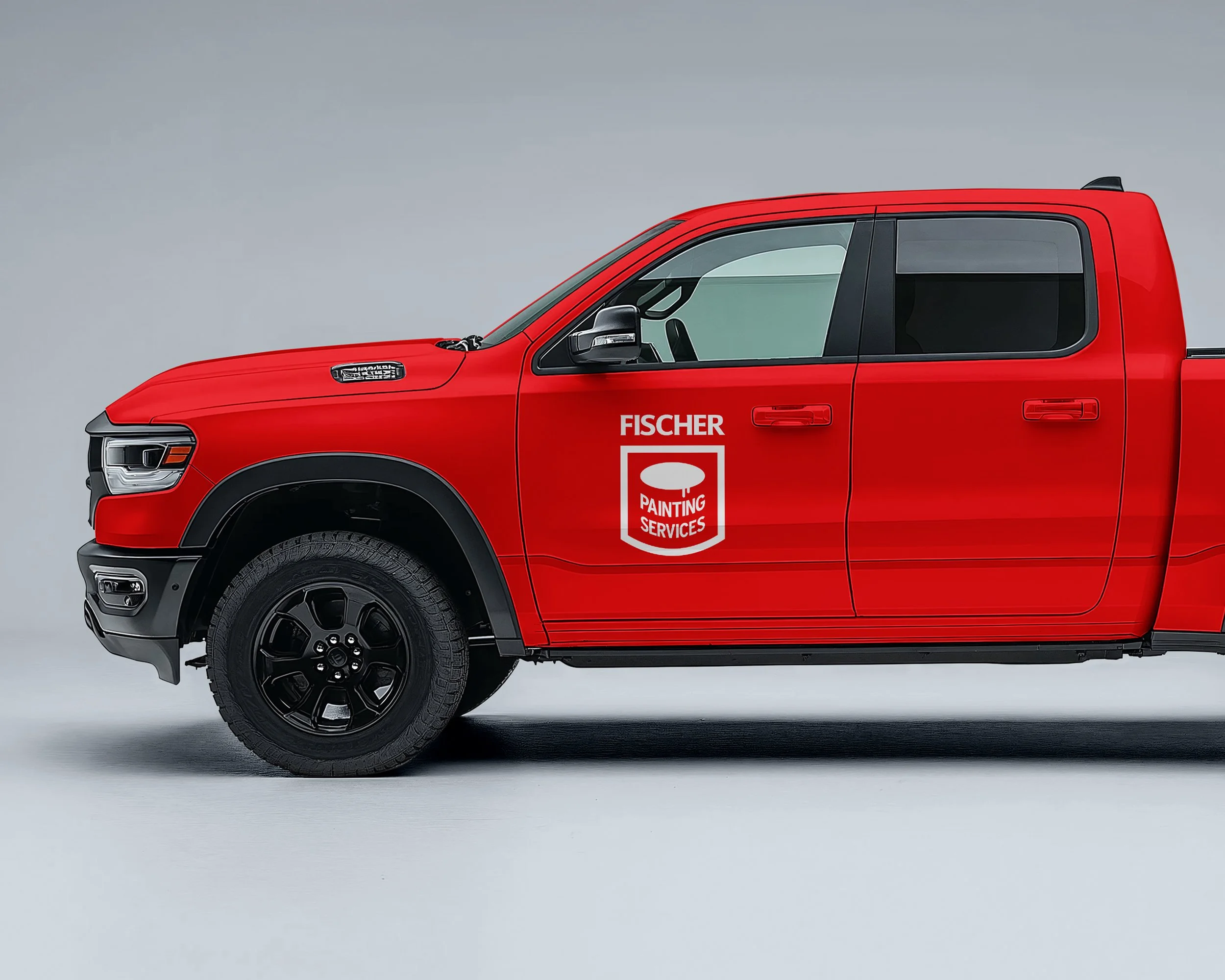
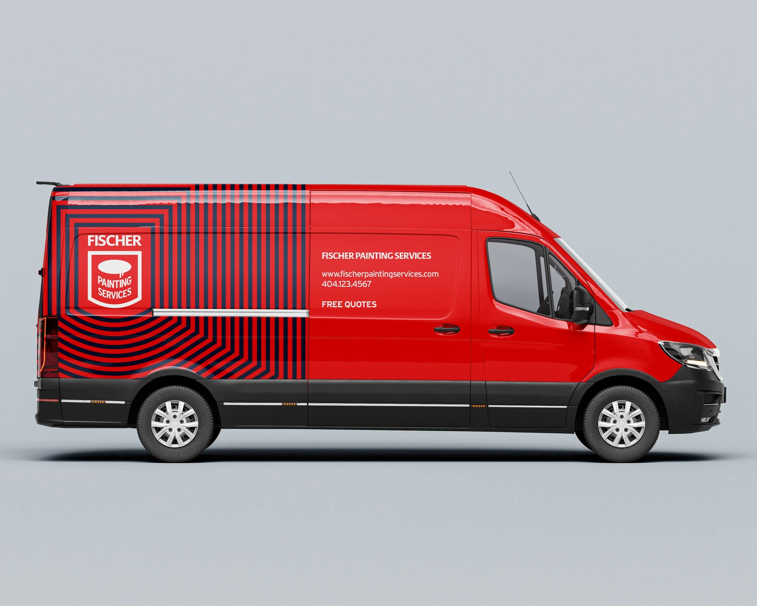
Vehicle graphics. The logo was optimized for vehicle wraps and magnetic decals — maximum contrast, clean edges, legible at highway speeds. A work truck that looks sharp and professional is one of the most powerful lead generation tools a contractor has. It parks in neighborhoods. It sits in driveways. It gets seen by every neighbor who walks by. A cluttered or hard-to-read logo wastes that moment. A clean, confident one owns it.
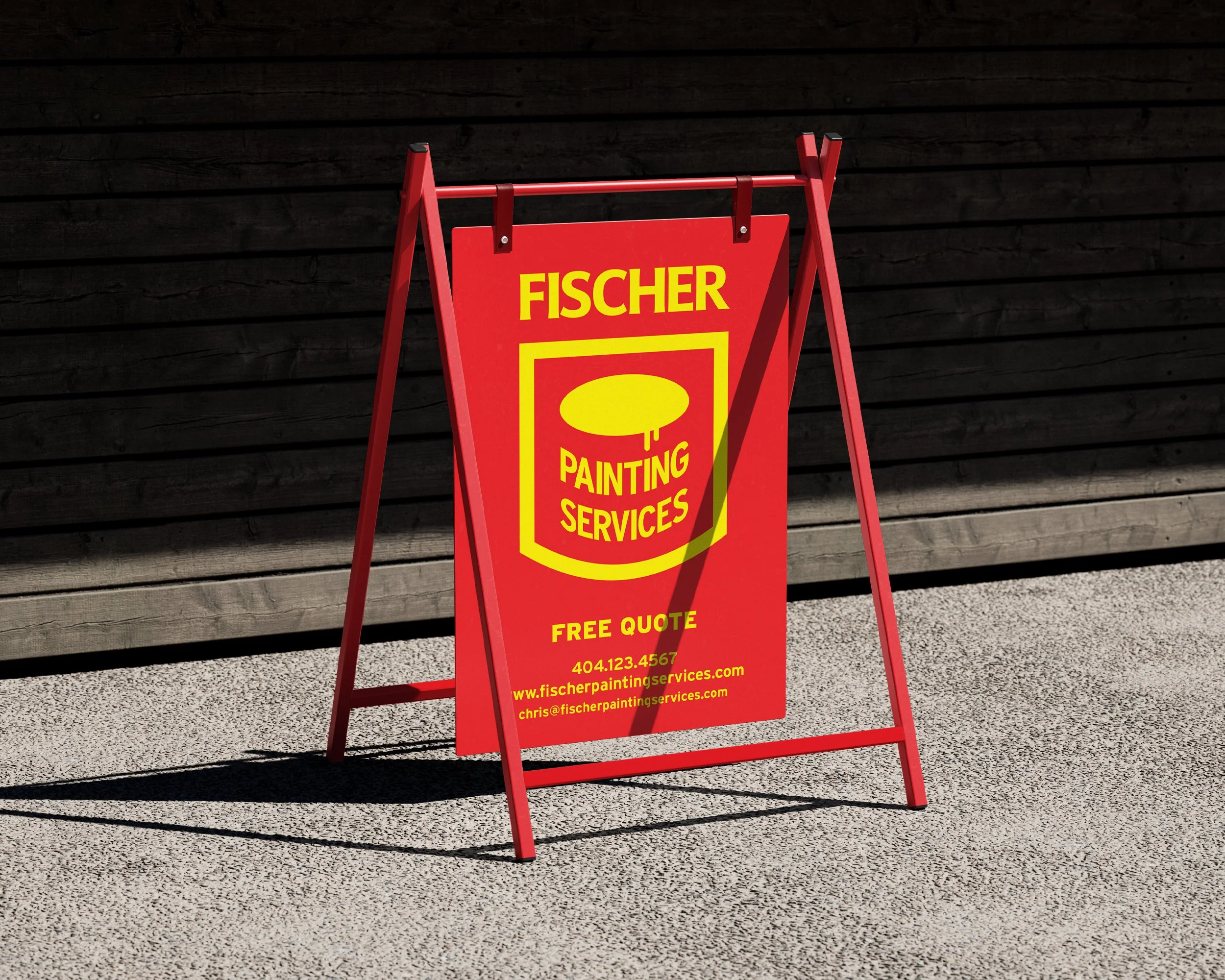
Yard signage. This was a priority from day one, and the system delivered. Clean layout, strong contrast, the business name and contact information reading clearly from across a lawn. Think about what a yard sign actually is — it's a billboard in someone's front yard, in a neighborhood full of the exact clients you want. Every week a sign stays up after a job is finished is a week of free, targeted advertising. It only works if people can actually read it.
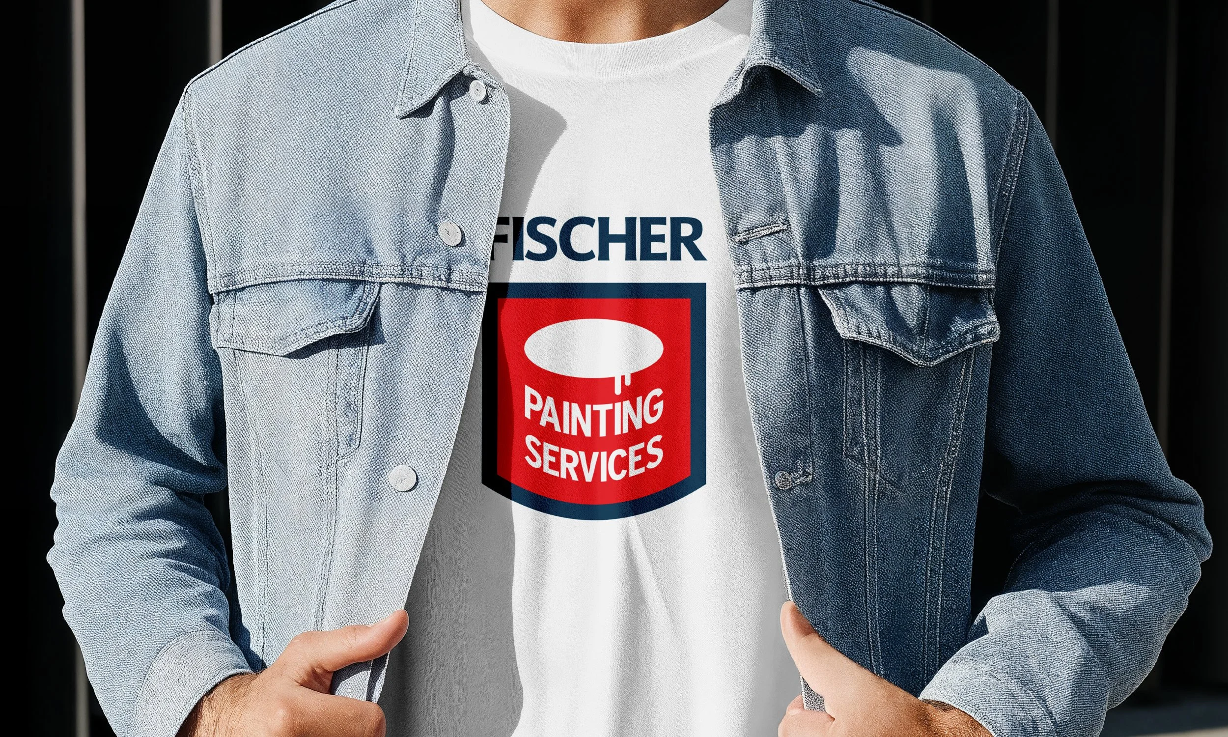
Print materials. Business cards and job estimates carry the same visual language — consistent colors, consistent type, a mark that looks equally at home on a professional letterhead or a quick handwritten estimate sheet. Consistency here builds subconscious trust. Every touchpoint that matches reinforces the message: this is a business that has its act together.
Digital and social. The logo adapts cleanly to profile images, social media headers, and email signatures. In a world where homeowners check Instagram and Google Business profiles before they call, a consistent digital presence matters. Simple branding scales to digital without losing anything — complex branding often falls apart at small sizes and low resolutions.
The result is a brand that looks like a single, cohesive business across every touchpoint — not a patchwork of assets that were designed at different times by different hands. And that cohesion? That's not just aesthetics. That's perceived value. That's the difference between a homeowner calling you and calling someone else.
What This Means for Your Business
If you're a contractor, a service provider, or a small business owner in the Gainesville or Atlanta area — or really anywhere — and you're reading this thinking this sounds like me, here's what I want you to know: You don't need an abstract, conceptual logo. You don't need something that requires explanation. You need something that works. Something that makes the right first impression on the right clients. Something that shows up consistently and confidently everywhere your business shows up.
The pain points I hear most from clients before we work together:
"I don't even know where to start."
"My current logo is fine but it doesn't feel professional."
"I've been putting this off for years because it feels overwhelming."
"I want to attract better clients, but I don't know if my branding is holding me back."
These are all solvable problems. And the first step isn't hiring a designer — it's getting clear on what you actually need. That's why I built the Brand Clarity Checklist. It's free, it takes about ten minutes, and it will give you a foundation to move forward — whether you work with me or someone else. If you're ready to talk about a rebrand or a new logo, I'd love to hear about your business. You can reach out directly through my contact page and we'll take it from there.
The Takeaway
Fischer Painting Services didn't need something clever. They needed something that worked — in the real world, at real scale, for real clients making real decisions about who to trust with their home. Simple, clean, intentional branding is not a compromise. It is not "settling." It is one of the most strategic decisions a growing business can make. Because simplicity scales. Simplicity travels. Simplicity reads on a truck door at 60 mph and on a phone screen at 2 inches wide. And simplicity, done right, communicates something that no amount of visual complexity ever can: confidence. When a business looks this put-together, this consistent, this clear — it earns trust before the first conversation. It attracts better clients. It justifies better pricing. It builds the kind of brand equity that compounds over time. That's the goal. Every time.
Ready to take the first step? Start with the Brand Clarity Checklist — or reach out directly to start a conversation about your brand.
Zach Summers is a strategic branding and identity designer based in Georgia, working with contractors, service businesses, and mission-driven organizations across the Atlanta area and beyond. See more projects →